A few days ago SAP announced SAP Business Suite 4 SAP HANA. Shortened to SAP S/4HANA, this is a big strategic launch. Here is why you need to take heed.
The new SAP S/4HANA is supposed to replace the SAP Business Suite (formerly R/3) over the next few years. This announcement and the launch of the software lay a roadmap for SAP in the coming years.
What led to this launch?
SAP is a leader in ERP worldwide. However, in the recent past, a new trend is taking over in the business world. Cloud-based software services also known as Software-as-a-Service. SAP has SaaS components to it, but its main business model has been selling software the old way: software installed at the customers’ premise.
Other cloud companies such as Workday have been slowly chipping away at SAP’s market share. And now this is SAP’s answer.
Name
The R in R/3 stood for real-time. The S in the S/4 stands for Simple. This is the big idea. SAP is planning on simplifying the ERP system with this release.
Database
While SAP R/3 Business Suite ran on any database, S/4 runs exclusively on HANA. SAP has spent considerable financial resources and effort on building up the in-memory database over the past few years. SAP HANA has tremendous performance advantages compared to the older disk-based database solutions. This large-scale change has enabled SAP to dramatically simplify both the data-model as well as the user-experience.
One significant aspect of HANA is that it is an in-memory appliance. This means data-access times (disk read/writes) are not an issue anymore, allowing developers to focus more on business logic than performance. This lends itself to the other motivation for S/4 – simplicity.
The Cloud
SAP S/4HANA is mostly a movement of SAP’s premier software from customer premise to the cloud. However, on-premise solution will still be available. SAP offers 3 options:
Public Cloud – Completely managed by SAP. Multi-tenancy shared by all public cloud customers
Private Cloud – Partially managed by SAP. Exclusive database per customer.
On-Premise – Software installed on client’s hardware. Client pays for user-licenses.
Software
SAP S/4HANA will allow customization to S/4HANA on the HANA Cloud Platform (HCP). This means ABAP developers will get to continue to use their skills. If you don’t know OO, it is a good time to learn it.
UI
Let’s admit it, SAP R/3 has not been known for its stellar user-experience. UI on SAP R/3 has been clunky, rigid and unwelcoming. But the S/4HANA user-interface will be based on SAP’s Fiori UX platform. SAP Fiori, launched earlier in 2014, gives the software a new look-and-feel. The fact it does not have licensing cost should make it attractive to customers with an existing SAP installation.
As far as I can tell, it will be a big improvement.
Innovation
I really don’t have anything to say about innovation, but you cannot write a whole post on SAP and not mention the word Innovation. So, that’s that.
Conclusion
Co-founder, Hasso Plattner said “If this doesn’t work, we’re dead. Flat-out dead.” This may be just Hasso Plattner being the passionate visionary that he is. But this indeed is a huge launch from SAP, one whose initial roll out is expected to be 3-5 years, and customer transitions lasting more 10 years.
Let’s wait and see if this works or we will be flat-out dead. But as Keynes said “In the long run, we are all dead.”
The remaining installments will be published in the next few weeks. I will update this article with links to them.
Can you build a computer that can think for you, and may be run your business? Computers have been an integral part of any business enterprise for a long time now, insomuch that everything we do in business has computers’ finger prints all over. But the primary function of computers has been that of aiding the humans in their running of the business, not actually running it for us. But a brave new generation of computers is on its way that plan on turning this paradigm on its head.
Imagine computers that think, that understand how your business is run, recognize what works and what does not, correct issues as they go along, and most importantly, ones that do this with virtually no aid from you. These computers almost do not exist today, but will be business-as-usual someday. What does it entail to build such computers? How much of this is hype and how much reality? What are the classes of problems these computers are expected to solve? A branch of study in Artificial Intelligence (AI) called Machine Learning has been trying to answer these questions.
What is machine learning?
A typical computer program is a series of instructions executed on a set of data. The code is supposed to read the data, manipulate and transform it. Machine learning, on the other hand is not about transforming data, instead about recognizing patterns in the data, discovering deep insights in the structure of the data, all on its own. In fact, it is even more than that: It is about a computer that understands data and gets smarter and smarter.
Machine leaning is about creating algorithms that start with a blank slate, and builds up its knowledge as they process and analyze data. The bigger the data, the smarter they get. The do so in a variety of ways.
Take for instance, a hypothetical chess-playing learning machine. This machine first learns the basic rules of chess by watching people playing chess – rook moves horizontally and vertically, bishop moves diagonally, etc. Then the computer learns the goal of the game – to win. To extend this example further, the computer learns how to achieve the goal. It learns from the games strategies. While the computer is never coded to perform any specific list of chess plays, it is designed to learn them from the input data – studying previous games and reassessing the games it plays against its opponents.
Hypoethetically, one copy of this software is given amateur chess player, and another one to, say, Gary Kasparov (former world chess champion), and both are allowed to play solely against their masters. After a certain period of time, if these two copies are made to go head to head, the latter copy will trounce the former. This is because the latter learned from a superior dataset, one that was accumulated playing against Kasparov.
To Teach or not to Teach
Broadly speaking, there are two categories of learning algorithms: Supervised and Unsupervised. If the input data also known as training-set is clearly labeled – the computer knows what it is looking at – then it is supervised learning. However, if your data is a big clutter of bits, and the computer starts off without knowing what it is looking at, but it learns as it goes along, that would be unsupervised.
For example, a face-recognition learning system processes several images of faces and non-faces from a training-set that is clearly labeled – faces in each image are marked and labeled. During the learning process, the computer isolates the unique features of faces that are not to be found on non-faces. Subsequently, the computer is now equipped with the “knowledge” of how to distinguish between faces and non-faces. The more images of faces and non-faces it processes, the stronger its knowledge is.
On the other hand, in the construction of a computer that classifies human emotions. The training-set contains no labels for facial expressions and how they correspond to human emotions. The system is fed series of video snippets with human faces containing various emotions and their subsequent actions. Your computer is supposed to see the subtle changes in the facial expression and group them into various categories and associate them with the subtle difference in the subsequent actions of these actors.
Given that these two examples of very simple, there may be an overlap in their classification. But the essential idea is this: Supervised is when the computer clearly starts off knowing what it needs to do, and goes on to becoming really good at doing that. On the other hand, in unsupervised learning, the computer typically has no idea what it is looking at or what it’s supposed to find, and then goes on to discover hidden pattern and deep structures in data.
Although different functionalities dictate which learning is more suitable for the specific purposes, when it comes to the context of big data, unsupervised learning algorithms are expected to be heavily used in the near future. Unsupervised learning is well-suited in systems of data which contains deep hierarchical and/or causal relationships between observations and/or latent variables.
Learning algorithms may not clearly fall along this dichotomy. Most algorithms have a combination of the two. Within the same system, some aspects of learning may be supervised, while others may be unsupervised.
Business Intelligence vs. Learning Machines
There are some striking similarities between the data mining components of Business Intelligence suites that are used for pattern recognition, and the actual machine learning implementations. While BI data mining is a set of tools and techniques used by humans to aid in pattern recognition and eventually make better decisions, machine learning is performed primarily to the advantage of the machines themselves — in order to perform better by reorganizing itself. There is a significant overlap in the various techniques used in these two domains of data analysis.
So how does a computer learn?
Another way of classifying learning machines is the expected output. Let us see the kinds of output we expect from these computers.
Regression Analysis: The excepted output of this computer is to find hidden relationships between two or more variables. For e.g., is there any relationship between the weather outside and my sales data.
Classification: The expected output on this learning system is to take a large chunk of data and classify them according to preset categories. For e.g., what criteria can I use to categorize my employees as top performers, team players and laggers.
Cluster Analysis: Similar to classification, cluster analysis takes a series of similar objects and classifies them. The difference between this and the previous method is that clustering has not preset categories. Objects scatter over the data-space, and computer identifies clusters in them. For e.g., identifying customer clusters for targeted marketing
Computers can learn to run your business for you
While the science of machine learning has been flourishing in the scientific and mathematical circles, the business community has been slow to adopt the trends. With the exception of financial institutions and some sales and marketing campaigns, thinking and learning machines have not made much headway. With the ubiquity and popularity of big data infrastructure, such as Hadoop, it is easy to see that the near future hold exciting trends in machine learning in the business.
Big data enables businesses to adopt machine learning technologies. The potential for machine learning as a field of study and its business applications is unlimited. There are so many problems we know, but do not know how to solve. There is a bigger list of problems that we do not even know exists, let alone know how to solve them. If we ever hope to discover these problems and solve them effectively, learning machines are our fiends.
Big data Analytics is the new buzz in town. It is every big data analysts’ dream to analyze data, big or small, and get insights into things that were previously unseen by others. And now we have the tools — software and hardware — to analyze large amounts of data in a way that leads to meaningful and sometimes actionable analytics.
However, data is only as valuable as the analysis one performs on it, and Analytics is only as insightful as the person doing the analysis. The main function of a Data Analyst is to derive actionable analytics from the swath of data available. Sometimes, the same data can be analyzed by different analysts reaching different conclusions – quite possibly contradictory conclusions. There are many reasons that might lead to this contradiction. I thought it would be a good idea to list some cautions on any exercise of data analysis, big or small.
Even a broken clock is right twice a day
As stated earlier, the analytics derived from data is only as insightful as the analyst performing it. As an analyst looking for patterns in data, you will encounter several apparent hits. While it is exhilarating to see patterns emerge from data analysis, it is just as important to look further to see if the emergent pattern is indeed a real-world pattern or just a statistical anomaly.
More often than not, emergent patterns are just that — patterns that appear in small segments of a larger data set. If patterns appear sporadically or sparsely, it is most likely a false positive. Large data sets inherently contain statistical anomalies. In fact, the bigger the data, the higher the probability that improbable (and consequently inaccurate) patterns are hidden in smaller subsets of the larger dataset.
Even a broken clock is right twice a day, and if you happen to check the time at those right times, you will wind up thinking that the clock was working.
Climate is not weather
I am always mildly amused by people who say things like “It’s so cold today; so much for global warming”. While I get that it is just a joke, the undertone in the statement clearly points to a lack of understanding in the difference between weather and climate, or more generally, perceiving apparent patterns in really random or unrelated events.
Science spokesperson and astrophysicist, Neil deGrasse Tyson drops some knowledge in this video below, a segment from his TV Show, Cosmos.
Courtesy: National Geographic
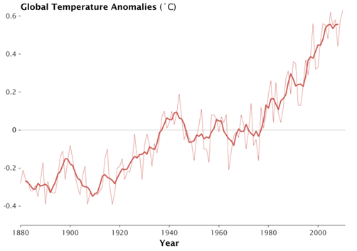
Keep your eye on the man, not the dog!
The point to take home is that, at smaller scales, the data might look either haphazard or manifest a specific pattern. However, applying a broader context may reveal another pattern, one that is quite different.
In the chart below (courtesy NASA Goddard Institute for Space Studies), the lighter line represents annual global temperatures, and the darker thicker line represent the 5 year running mean. If you focus on the thinner line, you will notice that patterns are haphazard. There are three years between 2000 and 2010 where the temperature is actually cooler than 1998. However, the thicker line which averages the 5 years around the data point shows a clear rise in temperature over the past couple of decades. Yet again, the thicker line also shows the temperatures flattening out in the last decade. It’s easy to see why one would just observe the last decade and claim the global temperatures have flattened. But upon closer inspection in a broader context, there have been similarly sized flattening happening in the 80s and 90s. The bigger picture from 1960 to 2010 is one of clear and undeniable growth.
Source: NASA Goddard Institute for Space Studies (http://www.giss.nasa.gov/)
Applying a broader context is an essential part of data analysis. Keep your eye on the man, not the dog!
Correlation does not imply causation
This phrase is very often used in statistics, almost to the point that it is common sense in the data analysis community. Despite that, it is often an overlooked occurrence.
A correlation between two variables, no matter how strong they appear, need not necessarily mean that one has a causal relationship with the other. In fact, it does not necessarily even mean that one has any relationship to the other.
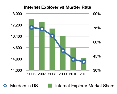
As shown in this comical chart below, there seems to be correlation between Internet Explorer usage and number of murders in the U.S. But it does not make any sense in the real world.
I am not sure if the data behind this chart is accurate, and I have no reason to believe one way or the other. However, I have no reason to believe that these two phenomena are even related, let alone one causes the other. Surely, it’s absurd to state that as people start using IE less they murder less, or the reverse, that as murder rates fall so does IE usage. However, the data seems to support these assertions.
While this example is patently absurd, there are many cases, where it might seem likely that there is a relationship. It is best to keep this catchphrase in the back of your minds: Correlation does not imply causation.
An extreme version of this catchphrase goes to the extent of saying that Causation can never be determined by analytical means, and should be left to the realm of philosophy. Correlation is good enough, as long as the corresponding hypothesis can be validated by its power of predictability. It essentially means that if a correlation is noted, and it is repeatable and predictable, then it is not required to prove the causality aspect of the correlation.
While it is important to understand that correlation does not imply causation, a strong correlation is sufficient to make effective business decisions. True causality is certainly a curiosity, but one that is quite unnecessary in the context of business intelligence.
A picture is worth a thousand numbers, or a couple of terabytes
While computers are very powerful number crunchers, we humans are far superior visual analyzers, at least as yet. Computers can analyze visual data, but they do so, by and large, by converting the graphical data into numerical equivalents.
We certainly should use the power of computational data analysis. At times though, there is nothing better than the good old staring-at-a-chart data analysis. This is not because of any inherent problem with computational methods. Instead, it is because of the simple fact that computers do what the data analyst asks it to do. The problem is when the data analyst does not know what to ask for.
Computational (statistical) tools like Standard Deviation and Linear Regression, while powerful in their own right, are not suitable to spot blips or spikes in otherwise smooth data, unless one knows to look for it. Plot it on a chart, and the human eye will catch it in a blink. Again, I am not arguing that looking at charts is the best way of looking for blips. If you know you’re looking for a blip, it is really easy to have the computer look for it for you. But, in case you didn’t know what irregularities exist in your data, it’s better to plot it on a chart, and let the human eye/brain look for them.
There are many tools that let you plot your data. Microsoft Excel is a good place to start.
Follow the data; don’t make the data follow you
Almost every exercise in data analysis starts with a hypothesis. Although it would be ideal to perform research with a blank slate and come to conclusions after the analysis, it is almost inevitable that you will start with a hypothesis. In fact, in statistical inference, one starts with a null hypothesis.
The problem is in setting up scientific experiments or performing data analysis with the intention of proving a hypothesis. This is where confirmation bias kicks in. The level of attachment you have to your hypothesis determines how many data points you observe that prove you’re right. This is reminiscent of an adage President Obama used during his 2008 Presidential campaign: “If all you have is a hammer, every problem looks like a nail.”
There is a saying in the scientific community, and I paraphrase: if you have a hypothesis and you want to know if it’s true or false, then do not set up your experiments to prove that it is true. Instead try to prove that it is false. And if you can’t, then it may be true.
Also, always remember: You can never prove that a non-trivial hypothesis is true. You can either prove that it is false or that it is not false.