Category Archives: Analytics

Get More Value From Operational Assets with Predictive Analytics

Kaan_groupSharpening operational focus and squeezing more efficiencies out of production assets—these are just two objectives that have COOs and operations managers turning to new technologies. One of the best of these technologies is predictive analytics. Predictive analytics isn’t new, but a growing number of companies are using it in predictive maintenance, quality control, demand forecasting, and other manufacturing functions to deliver efficiencies and make improvements in real time. So what is it?

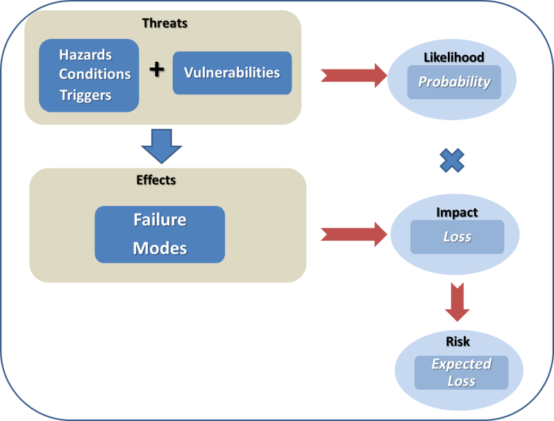
Predictive analytics is a blend of mathematics and technology learning from experience (the data companies are already collecting) to predict a future behavior or outcome within an acceptable level of reliability.

Predictive analytics can play a substantial role in redefining your operations. Today, let’s explore three additional cases of predictive analytics in action:

  • Predictive maintenance
  • Smart grids
  • Manufacturing

Predictive Maintenance

Predictive maintenance assesses equipment condition on a continuous basis and determines if and when maintenance should be performed. Instead of relying on routine or time-based scheduling, like having your oil changed every 3,000 miles, it promises to save money by calling for maintenance only when needed or to avoid imminent equipment failure.

While equipment is in use, sensors measure vibrations, temperature, high-frequency sound, air pressure, and more. In the case of predictive maintenance, predictive models allow you to make sense of the streaming data and score it on the likelihood of failure occurring. Coupled with in-memory technologies, it can detect machine failures hours in advance of it occurring and avoid unplanned downtime by scheduling maintenance sooner than planned.

This all means less downtime, decreased time to resolution, and optimal longevity and performance for equipment operators. For manufacturers, predictive maintenance can streamline inventory of spare parts and the ongoing monitoring services can become a source of new revenue. And as predictive maintenance becomes part of the equipment, it also has the potential to become a competitive advantage.

Smart Grids

Sensors and predictive analytics are also changing the way utilities manage highly distributed assets like electrical grids. From reliance on unconventional energy sources like solar and wind to the introduction of electric cars, the energy landscape is evolving. One of the biggest challenges facing energy companies today is keeping up with these rapid changes.

Smart grids emerge when sensor data is combined with other data sources such as temperature, humidity, and consumption forecasts at the meter level to predict demand and load. For example, combined with powerful in-memory technologies, predictive analytics can be used by electricity providers to improve load forecasting. That leads to frequent, less expensive adjustments that optimize the grid and maintain delivery of consistent and dependable power.

As more houses are equipped with smart meters, data scientists using predictive analytics can build advanced models and apply forecasting to groups of customers with similar load profiles. They can also present those customers with some ideas to reduce their energy bill.

Manufacturing

The manufacturing industry continues its relentless drive for customization and “Lot sizes of 1” with innovations such as the connected factory, the Internet of Things, next shoring, and 3D printing. It’s also hard at work making sure it extracts the maximum productivity from existing facilities, which traditionally has been accomplished by using automation and IT resources. According to Aberdeen, the need to reduce the cost of manufacturing operations is now the top reason companies seek more insight from data.

Quality control has always been an area where statistical methods have played a key role in whether to accept or reject a lot. Now manufacturers are expanding predictive analytics to the testing phase as well. For example, tests on components like high-end car engines can be stopped long before the end of the actual procedure thanks to predictive analytics. By analyzing test data from the component’s ongoing testing against the data from other engines, engineers can identify potential issues faster. That in turn, maximizes the capacity available for testing and reduces unproductive time. That is only one of the many applications manufacturers find for predictive analytics.

Innovations on the Shop Floor

Predictive analytics provides an excellent opportunity for COOs and operations managers to extract additional value from production assets. It can also be an opportunity to create critical differentiators in the way products are created and delivered to customers—by providing it as a paid service (predictive maintenance) or as insight (predicting future electricity consumption).

However a company chooses to use it, predictive analytics can be the key to beating the competition.

Discover and Follow

And join the predictive conversation by following me on Twitter @pileroux.

AmickBrown.com


What if Beethoven and Mozart Invented Their Own Notation System

sheet_music_violinTo appreciate how semantic notation can impact your business, take a step back for a moment and imagine if every composer from Mozart to Beethoven used a different notation system. How would conductors and musicians interpret the music in a moment without standardized notation? What if engineers didn’t have a standardized notation system? Most likely they wouldn’t be able to communicate vast amounts of information clearly and quickly.

Yet in business, there is an overabundance of ways to layout out corporate reports and dashboards. And even within a single company, you will find forecast data or averages defined and displayed differently. But with pattern recognition, you can immediately understand the context of that information. This is the essence of a standard notation system, which brings clearer, data-driven insights and faster visualization turnaround.

Communicate Vast Amounts of Data-Driven Insights with Clearer, More Aligned Messages

Executives can  digest and act on visual data faster when it is always laid out the same: forecast, averages, historical and all metrics always looks the same and are in the same layout. People learn quickly to recognize patterns, and this is helpful to interpreting volumes of data. Critical to good business decision-making is the ability to portray very dense amounts of information, while maintaining clarity. This is vital when extrapolating multiple metrics for data to understand how it relates to the business.

A visualization that shows a percentage breakdown of revenue into products is, in itself, not very useful. To act and make better decisions, you need to understand how revenue has changed over time and to compare it to other product lines, the budget, profit margin, and market share. Also, executives spend less time trying to align the data into one version of the truth when all metrics are calculated and portrayed using the same standards across all business units. Having a standard notation system in your business can help you foster data-driven culture and alignment for better decision making. 

Faster and Improved Visualization of Analysis and Insights

Although content creators spend less time inventing their own system and layout, they still follow guidelines. In speaking with people who have adopted international business communications standards (IBCS), they found, for example, that the average time to create dashboard dropped three-fold. Through standard notation systems, they shortened implementation times and improved the outcome of their analytics investments.

Don’t Start from Scratch – These Are Best Practices

One of the best-developed, semantic notation systems – which was only chosen by the SAP Executive Board back in 2011 – is based on an open source project called International Business Communications Standards. Anyone can join the association and benefit from years of thought leadership and best practices developed over decades. Plus, the community is included in the evolution of these standards.

Register for the Standards Course

OpenSAP allows you to learn anywhere, anytime and on any device with free courses open to the public.

This blog orignially appeared on the  D!gitalist Magazine by SAP and SAP Business Objects Analytics blog has been republished with permission.


Dresner’s Advanced and Predictive Analytics Study Ranks SAP #1 for Second Time in a Row

By  Chandran Saravana,  Senior Director Predictive Analytics Product Marketing

For the second year in a row SAP has received the number one ranking in the Wisdom of Crowds 2016 Advanced and Predictive Analytics Market Study by Dresner Advisory Services. The Dresner study reached over 3000 organizations and vendors’ customer communities and 20+ industry verticals with an organization size ranging from 100 to 10,000+.

Study findings include:

  • Organizations view advanced/predictive analytics as building on existing business intelligence efforts.
  • Over 90% agree about the importance and value of advanced and predictive analytics.
  • Statisticians/data scientists, business intelligence experts, and business analysts are the greatest adopters of advanced and predictive analytics.
  • Regression models, clustering, textbook statistical functions, and geospatial analysis are the most important analytic user features/functions.
  • Usability features addressing sophisticated advanced/predictive analytic users are almost uniformly important today and over time, led by easy iteration, advanced analytic support, and model iteration.
  • In-memory analytics and in-database analytics are the most important scalability requirements to respondents, followed distantly by Hadoop and MPP architecture.

I find it interesting that the Dresner study finds “Hybrid roles are also evident” and confirms SAP’s customer organization usage of predictive analytics. The research study looked at core advanced and predictive features, data preparation, usability, scalability, and integration as key criteria to rank the vendors.  Though usability criteria looked at many things, I would like to highlight one key one—“Support for easy iteration”—that ranked as most important.

In the scalability criteria, “In-memory analytics” ranked as most important one followed by “In-database analytics” and “In-Hadoop analytics (on file system).”

Read the Complete Dresner Report

You can find lots more in the 92-page Dresner Wisdom of the Crowds report. I invite you to take a look.

AmickBrown.com

The Self-Service BI Application Dinner: Restaurant Guests and Home Cooks

chef_prepares_dishIn a recent thread on social media, there was an interesting discussion about just “how self-service-like” today’s self-service analytics components really are. Some of the thread contributors doubted whether self-service BI was really something one could hand over to a business end-user. They are concerned whether self-service really can exist in the day-to-day life of an end user.  “Isn’t there always some ICT intervention needed?”someone asked. It’s an interesting discussion that hasn’t a black and white answer. So let’s take a closer look with the help of a restaurant analogy.

The doubters in the social media thread were talking about self-service for data analysts. But there is a small, but strict, difference between self-service for the end user or consumers, and self-service for data analysts. To explain this, I’ll  need to use the analogy of an analytics dinner, and consider the differences between the home cook and the restaurant guest.

The BI Restaurant Guest

Our guests “equal” the business end users of analytics. A dinner can be seen as a collection of analytical insights. The insights are thoroughly selected as our guests pick either from a menu—and ordering à la carte—or they go to the buffet and pick the things presented to them already ready for consumption. Ordering à la carte refers to end users opening specific dashboards, reports, or storyboards from the business analytics portal.

The BI restaurant guest’s workflow is:

  • Screen the menu and roughly select the type and amount of items they want. Our analytics end user chooses whether he/she needs financial info or logistic info, and what kind of detail-level is needed.
  • Next our guest chooses a specific item from the menu. In analytics terms, the user decides which reports, dashboard and/or storyboards he/she needs to get the insights required. Our user also decides on prompts or variables needed to get the specific scope of the insights.
  • When dinner is served our guest just enjoys what he/she asked for, leaving leftovers if feeling like it.

buffet_dinner_tableThe BI restaurant buffet guest’s workflow is similar, with the difference being that adding special requests (like steak well done) is not possible. However, the buffet allows the guest to digest multiple small plates according to their individual needs, just like an analytical end user could consume reports and dashboards in random order.

Our guest will typically be a user of existing SAP BusinessObjects Design Studio applications or SAP BusinessObjects Cloud storyboards. I have stipulated how they work in this article.

The BI Analytics Home Cook

Our next ‘flavor’ of a self-service user is the home cook that has to cook for him/herself. This user is more like a data analyst. Somebody who may not have a clear view on what kind of insight is needed, or requires insight on non-corporate data that is not explored on a regularly basis.

Here the workflow differs. Imagine the workflow of the TV cooks we all see on tele every single day; it is the exact same workflow as our self-service end user.

1.      Our home cook opens up the fridge and explores the ingredients needed; think of the data analysts that accesses the data sources he/she requires to start exploring data.

2.      Next our home cook starts cleaning, cutting, seasoning, mixing and combining his/her ingredients. Only those pieces of the ingredients that are needed for the meal are used. This is where our data analyst starts filtering, enriching (hierarchies, formulas), blending (combining data sources) and cleaning his data.

3.      When this is all done, we typically see the home cook putting his selected ingredient-mix in the pot on the stove. This is where the data analysts starts creating the visualizations, graphs, and maps and combines them to a final storyboard which might be shared with others later on.

4.      Our home cook makes quite an important decision in the last step; either they serve the plate to their guests (his colleagues or management), or the final meal is just put on a buffet for guests/users to consume.

The Final Analysis

So in the end I believe self-service always needs to be seen in the context of the type of end user. Do we talk about a guest in our restaurant who wants to digest analytics, play with the data to any extent and conclude on the fly, or do we talk about a home cook who needs to create the insights from scratch?

In terms of the guest, self-service BI 100% exists today in the sense that they can use applications and reports and do anything (!) with the data as longs as this data is part of the menu. For  home cooks, there is a bit more work to be done—they need to open the fridge and make choices. Maybe some of the ingredients are not in, and our cook needs to go to the shop to buy them. Also, the personal touch given to the meal is fully on the creativity and capability of our cook.

Oh, and You Mr. Restaurant-Owner, What Do You Think?

If you happen to be the restaurant owner—BICC or ICT manager—of course you decide on the quality of the overall meals presented by managing ingredients and menus, but you also monitor the experience your guests go through. We might call this governance and organization. Even in self-service environments, the restaurant owner is key to the success of the restaurant. If you fail, your guests will go somewhere else.

This blog is excerpted from Iver van de Zand’s article, “How ‘Self-Service Like’ Are BI Applications Really? Buffet or a la Carte.” Read the complete article at the Iver van de Zand blog.

In the New Digital Economy, Everything Can Be Digitized and Tracked : Now What?

Woman Buying ClothesWelcome to a world where digital reigns supreme. Remember when the Internet was more of a ‘push’ network? Today, it underpins how most people and businesses conduct transactions – providing peer-to-peer connections where every single interaction can be tracked.

Enterprises are still not taking full advantage. With hundreds of millions of people connected, it’s possible for them to connect their suppliers with their customers and their payment systems, and reach the holy grail of seamlessly engaging in commerce, where a transaction can be tracked from purchase, to order received, to manufacturing, through to shipment— all in real time. It’s clear that end-to-end digitization delivers enormous potential, but it has yet to be fully tapped by most companies.

In the latest #askSAP Analytics Innovations Community Webcast, Reimagine Predictive Analytics for the Digital Enterprise, attendees were given an introduction to SAP BusinessObjects Predictive Analytics, along with some key use cases. The presentation covered native in-memory predictive analytics, deploying predictive analytics on Big Data, and how to bring predictive insight to Business Intelligence (BI).

The live, interactive call was moderated by  SAP Mentor  Greg Myers and featured expert speakers Ashish Morzaria, Global GTM Director, Advanced Analytics, and Richard Mooney, Lead Product Manager for Advanced Analytics.

The speakers noted that companies used to become leaders in their industries by establishing an unbeatable brand or by having a supply chain that was more efficient than anyone else’s. While this is still relevant in the digital economy, companies now have to think about how they can turn this new digital economy to their advantage. One of the keys is turning the digital economy’s key driver —the data— to their advantage.

Companies embracing digital transformation are outperforming those who aren’t. With predictive analytics, these companies can use historical data to predict behaviors or outcomes, answer “what-if” questions, and ensure employees have what they need to make optimized decisions. They can fully leverage customer relationships with better insight, and make meaningful sense of Big Data.

One big question delved into during the call: How can companies personalize each interaction across all channels and turn each one into an advantage? The answer: By getting a complete digital picture of their customers and applying predictive analytics to sharpen their marketing focus, optimize their spend, redefine key marketing activities, and offer product recommendations tailored to customers across different channels.

Real-World Customer Stories

The call also focused on some real-world examples of customers achieving value by using and embedding predictive analytics in their decisions and operations, including Cox Cable, Monext, M-Bank, and Mobilink.

These companies have been able to improve performance across thousands of processes and decisions, and also create new products, services, and business models. They’ve squeezed more efficiencies and margins from their production assets, processes, networks, and people.

One key takeaway is the importance of using algorithms, as they provide insights that can make a business process more profitable or competitive, and spotlight new ways of doing business and new opportunities for growth.

The speakers also presented a very detailed customer case study on Harris Logic. The company is using SAP BusinessObjects Predictive Analytics for automated analytics and rapid prototyping of their models. They execute models into SAP HANA for real-time predictions using a native, logistical regression model. This approach is allowing for the identification of key predictors that more heavily influence a behavioral health outcome.

Learn More

Lots of food for thought. See what questions people were asking during the webcast and get all of the answers here. Check out the complete presentation, and continue to post your questions and watch for dates for our upcoming webcast in the series via Twitter using #askSAP.

AmickBrown.com

What You Need to Know About Supply Chain Risk

#3 in  series by Matthew Liotine, Ph.D. , Strategic Advisor, Business Intelligence and Operations, Professor University of Illinois

In our previous articles, we discussed how disruptions to a supply chain can originate from a multitude of sources. According to some current trends, it is apparent that there is continued rise in measured losses from disruptions such as natural events and business volatility. Traditionally, supply chains are designed for lean operational efficiency wherever possible, yet such efficiency requires the minimization of excess capacity, inventory and redundancy – the very things that are needed to create resiliency against disruptive risks. Risk assessment tools and methodologies help decision-makers to identify the most cost effective controls that can strike the right balance between cost and risk reduction to protect against disruption. Typically, the most cost effective controls are those that can minimize the common effects arising from multiple disruptive threats. In order to understand the kind of controls that could be effective, one must recognize the risk outcomes from common supply chain vulnerabilities, which is the focus of this article.

What is Risk?

Before continuing, it would be worthwhile to revisit some of the terminology that we have been using in previous discussion, in order to understand how risk is derived. Fundamentally, risk is the chance (or the probability) of a loss or unwanted negative consequence. For decision purposes, it is often calculated numerically as a function of probability and impact (sometimes called single loss expectancy), and quantitatively expressed as an “expected” loss in monetary value or some other units. A common flaw with using risk values is that they mask the effects of impact versus probability. For example, an expected loss of $100 does not reflect whether high impact is overwhelming low probability, or high probability is overwhelming low impact. Thus, it is not clear whether this value is the expected loss due to an event that occurs 10% of the time and causes $1000 in damages when it occurs, or due to an event that occurs 20% of the time and causes $500 in damages when it occurs. For this very reason, risk values must be used in conjunction with probability and damage values, along with many other metrics, in order for the decision maker to compare the one risk against another. Risk values are not precise and are usually not to be used as standardized values for business management. Nevertheless, risk values can be used to provide decision makers with a means to distinguish risks and control options on a relative basis. Figure 1 illustrates the fundamental parameters that are used to construct risk values, and how they relate to each other.

SC 3 graphic

Figure 1 – Fundamental Components of Risk

Hazards, conditions and triggers are situations that increase or cause the likelihood of an adverse event (sometimes referred to as a peril). In our last article, we examined numerous sources of hazards that can threaten a supply chain. Vulnerabilities are factors that can make a system, in our case a supply chain, susceptible to hazards.  They are usually weaknesses that can be compromised by a hazardous condition, resulting in a threat. The likelihood, or probability, of a threat circumstance occurring must be considered, for reasons discussed above. If it occurs, failures can take place, whose effects are quantified as impacts. When impacts are weighed against the likelihood of the threat, the result is a risk that poses an expected loss. Controls are countermeasures that a firm can use to offset expected losses.

With respect to a supply chain, there are many ways to classify risk. Academics have made many attempts to try to classify risks according to some kind of ontology or framework (Harland, Brenchley and Walker 2003) (Gupta, Kumar Sahu and Khandelwal 2014) (Tummala and Schoenherr 2011) (Peck 2005) (Monroe, Teets and Martin 2012) (Chopra and Sodhi 2004). Some of the more common supply chain risk classifications include:

Recurring risks – These risks arise within the operational environment due to the inability to match supply and demand on a routine basis. The ensuing effects are lower service levels and fill rates.

Disruptive risk – These risks result from loss of supply or supplier capacity, typically driven by some disruptive event.

Exogenous risk – These risks arise within the operational environment and are process driven (e.g. poor quality control, design flaws, etc.), usually within the direct influence of the firm. They typically require the use of preventive mechanisms for control.

Endogenous risk – These risks originate externally, either from the supply side or demand side, which may not necessarily be under a firm’s direct influence. They typically involve the use of responsive mechanisms for control.

While many classification attempts have been noble in nature, in the end it is difficult to classify risks according to a single scheme, for a variety of reasons. First, the lines of demarcation between risk categories can be blurred and there could be overlap between them. For example, from the above categories, one can easily argue about the differences between exogenous and recurring risks. Second, every firm is different, and thus one framework may not fit all. Finally, risk methodology approaches may differ somewhat across various industries, as evidenced by different industry best practices and standards for risk analysis.

Supply chains can exhibit many kinds of vulnerabilities, but quite often these can be viewed as either structural or procedural in nature. Structural vulnerabilities stem from deficiencies in how the supply chain is organized, provisioned and engineered. Single points of failure can arise when there is insufficient diversity across suppliers, product sources or the geographical locations of sources. Inadequate provisioning can create shortages in inventory or capacity to meet customer demands. Procedural vulnerabilities stem from deficiencies in business or operational processes. Gaps and oversights in planning, production or transport processes could adversely affect a firm’s ability to respond to customer needs. Insufficient supply chain visibility could render a firm blind to oversights in supplier vetting and management practices, quality assurance and control, or demand planning.

Such kinds of vulnerabilities, combined with an aforementioned hazardous condition, results in the supply chain failing in some fashion. Table 1 illustrates some of the more common modes of supply chain failure.

Table 1 – Common Supply Chain Failure Modes

Degraded fill rate

Degraded service level

High variability of consumption

Higher product cost

Inaccurate forecasts

Inaccurate order quantity

Information distortion

Insufficient order quantities

Longer lead times/delays

Loss of efficiency

Lower process yields

Operational disruption

Order fulfillment errors

Overstocking/understocking

Poor quality supplied

Supplier stock out


Ultimately, such supply chain failures result in increased costs, loss of revenue, loss of assets, or combination thereof. Common risks are typically assessed as increases in ordering costs, product costs, or safety stock costs. Product stock out losses can be assessed as backorder costs or loss of sales and business revenue. Different kinds of firms will be prone to different types of risks. For example, a manufacturing firm with long supply chains will be more susceptible to ordering variability (or bullwhip) types of effects versus a shorter retail supply chain which would be more sensitive to fill rate and service level variability. Understanding and characterizing these risks is necessary in order to develop strategies to control or manage them. Quantifying risks provides the decision maker with a gauge to assess risk before and after a control is applied, thereby assessing the prospective benefit of a potential control. Using quantified risk values, in combination with other parameters, enables a decision maker to prioritize potential control strategies according to their cost-effectiveness.

Conclusions

Risk is the chance or the probability of a loss or unwanted negative consequence. Inherent supply chain weaknesses such as sole sourcing, process gaps or lack of geographical sourcing diversity can render a supply chain more vulnerable to some hazardous, unforeseen condition or trigger event, such as a strike or major storm, resulting in undesirable increases in costs, asset loss or revenue loss. Such risks can be quantified to some extent, quite often in monetary units, and can be used to facilitate cost-benefit analysis of potential control strategies. In our next article, we will take a look some of the most favored strategies to control supply chain risk.

AmickBrown.com

Bibliography

Chopra, S., and M. Sodhi. “Managing Risk to Avoid Supply-Chain Breakdown.” MIT Sloan Management Review, 2004: 53-61.

Gupta, G., V. Kumar Sahu, and A. K. Khandelwal. “Risks in Supply Chain Management and its Mitigation.” IOSR Journal of Engineering, 2014: 42-50.

Harland, C., R. Brenchley, and H. Walker. “Risk in Supply Networks.” Journal of Purchasing & Supply Management, 2003: 51-62.

Monroe, R. W., J. M. Teets, and P. R. Martin. “A Taxonomy for Categorizing Supply Chain Events: Strategies for Addressing Supply Chain Disruptions.” SEDSI 2012 Annual Meeting Conference Proceedings. Southeast Decision Sciences Institute, 2012.

Peck, H. “Drivers of Supply Chain Vulnerability.” International Journal of Physical Distribution & Logistics Management, 2005: 210-232.

Tummala, R., and T. Schoenherr. “Assessing and Managing Risks Using the Supply Chain Risk Management Process (SCRMP).” Supply Chain Management: An International Journal, 2011: 474-483.


10 Data Visualizations You Need to Know Now

word cloud predictive dataNo one likes reading through pages or slides of stats and research, least of all your clients. Data visualizations can help simplify this information not only for them but you too! These ten different data visualizations will help you present a wide range of data in a visually impactful way.

1.Pie Charts and Bar Graphs—The Usual Suspects for Proportion and Trends

New to data visualization tools? Start with the traditional pie chart and bar graph. Though these may be simple visual representations, don’t underestimate their ability to present data. Pie charts are good tools in helping you visualize market share and product popularity, while bar graphs are often used to compare sales revenue over the years or in different regions. Because they are familiar to most people, they don’t need much explanation—the visual data speaks for itself!

2.Bubble Chart—Displaying Three Variables in One Diagram

When you have data with three variables, pie charts and bar graphs (which can only represent two variables at the most) won’t cut it. Try bubble charts, which are generally a series of circles or “bubbles” on a simple X-Yaxis graph. In this type of chart, the size of the circles represents the third variable, usually size and quantity.

For example, if you need to present data on the quantity of units sold, the revenue generated, and the cost of producing the units, use a bubble chart.  Bubble charts immediately capture the relationship between the three variables and, like line graphs, can help you identify outliers quickly. They’re also relatively easy to understand.

3.Radar Chart—Displaying Multiple Variables in One Diagram

For more than three variables in a data set, move on to the radar chart. The radar chart is a two-dimensional chart shaped like a polygon with three or more variables represented as axes that start from the same point.

Radar charts are useful for plotting customer satisfaction data and performance metrics. Primarily a presentation tool, they are best used for highlighting outliers and commonalities, as radar charts are able to simplify multivariate data sets.

4.Timelines—Condensing Historical Data

Timelines are useful in depicting chronological data. For example, you can use it to chart company milestones, like product launches, over the years.

Forget the black and white timelines in your history textbooks with few dates and events charted. With simple tools online, you can add color and even images to your timeline to accentuate particular milestones and other significant events. These additions not only make your timeline more visually appealing, but easier to process too!

5.Arc Diagrams—Plotting Relationships and Pairings

The arc diagram utilizes a straight line and a series of semicircles to plot the relationships between variables (represented by nodes on the straight line), and helps you to visualize patterns in a given data set.

Commonly used to portray complex data, the number of semicircles within the arc diagram depends on the number of connections between the variables. Arc diagrams are often used to chart the relationship between products and their components, social media mentions, and brands and their marketing strategies. The diagram can itself be complex, so play around with line width and color to make it clearer.

6.Heat Map—For Distributions and Frequency in Data

First used to depict financial market information, the heat map has nothing to do with heat but does display data “intensity” and size through color. Usually utilizing a simple matrix, the 2D area is shaded with different colors representing different data values.

Heat maps are not only used to show financial information, but web page frequency, sales numbers and company productivity as well. If you’ve honed your data viz skills well enough, you can even create a heat map to depict real time changes in sales, the financial market, and site engagement!

7.Chloropleth and Dot Distributions Maps—For Demographic and Spatial Distributions

Like heat maps, chloropleths and dot distribution maps use color (or dots) to show differences in data distribution. However, they differ from heat maps because they’re specific to geographical boundaries. Chloropleths and dot distribution maps are particularly useful for businesses that operate regionally or want to expand to cover more markets, as it can help present the sales, popularity, or potential need of a product to the client in compelling visual language.

8.Time Series—Presenting Measurements over Time Periods

This looks something like a line graph, except that the x-axis only charts time, whether in years, days, or even hours. A time series is useful for charting changes in sales and webpage traffic. Trends, overlaps, and fluctuations can be spotted easily with this visualization.

As this is a precise graph, the time series graph is not only good for presentations (you’ll find many tools to help you create colorful and even dynamic time series online), it’s useful for your own records as well. Professionals both in business and scientific studies typically make use of time series to analyze complex data.

9.Word Clouds—Breaking Down Text and Conversations

It may look like a big jumble of words, but a quick explanation makes this a strong data visualization tool. Word clouds use text data to depict word frequency. In an analysis of social media mentions, instead of simply saying “exciting” has been used x number of times while “boring” has been used y number of times, the word that is used most frequently appears the largest, and the word that hardly appears would be in the smallest font.

Word clouds are frequently used in breaking down qualitative data sets like conversations and surveys, especially for sales and branding firms.

10.Infographics—Visualizing Facts, Instructions and General Information

Infographics are the most visually appealing visualization on this list, but also require the most effort and creativity. Infographics are a series of images and text or numbers that tell a story with the data. They simplify the instructions of complex processes, and make statistical information easily digestible. For marketers, infographics are a popular form of visual content and storytelling.

Get more information on building charts, graphs and visualization types.

– See more at: http://blog-sap.com/analytics/2016/07/11/10-data-visualizations-you-need-to-know-now/#sthash.UXqH0lkE.dpuf

Part 1: Winning your End Users – SAP BusinessObjects Design Studio or SAP BusinessObjects Lumira or …

 by Iver van de Zand,  Guest Blogger


confused_lost_man_cartoonBeing part of one of the leading software companies is great and brings advantages and (sometimes) disadvantages. A key element I like so much in my work is that with my company I can be part of large—or even huge—scaled analytics journeys with customers and BI competence centers who need to serve thousands and thousands of users. In today’s digital economy, they all struggle similar challenges. Let us focus on the business users and reflect their biggest requirements for analytics, and how this often brings us to the self-service dilemma.

Enterprise End Users Require at Least:

  • Self-service capabilities: Business users require a great deal of autonomy in their analytics work. They want to easily create, deploy and share their business analytics content themselves without being too reliant on their ICT or BI Competence Centers. The data analysts among them even require access to non-corporate data in order to blend this with the corporate data and search for new insights.
  • Agility and Flexibility: It’s almost become a magical word, ‘agility’ is what I hear every user talking about. Users nowadays require full-flavor flexibility when using analytics. It means easy accessible on any device, the ability to change graph types on the fly. It also means being able to swap measures and attributes at any place in the analytics dashboard, storyboard, or report. Users also require drill-anywhere capabilities and a definite must-have is to drill to the transactional level if applicable. The agility requirements for tooling are based on what the business decision makers’ need to have towards process or market fluctuations and their customer needs
  • financial dashboardOnline or real-time information, yet still highly performant. As you already expected, all the users I met want the data to be accessible in real-time and—ideally—also online. I understand that need; driven by this agility, users absolutely need to have the latest data to respond to any fluctuation in process or market.
  • Consistency in metrics and metadata: Though this should be a no-brainer, users frequently mention that they’ve had negative experiences in the past with consistency in metrics and metadata. In any type of business analytics applications (reports, storyboard, workspaces or dashboards) they expect consistency in metrics, the use of definitions, hierarchies, prompts variables or other metadata-related content. End of the line!
  • Governed: Oh yes, end users do have concerns about governance. Though everybody always wants to have access to anything, deep in their hearts they all understand authorizations and security are top notch subjects and need to be treated with ultimate care. Another one here is SSO (Single Sign On)—would you like to logon and enter your credentials 75 times per day? Nah, don’t think so, so SSO is a must-have.
  • Visually appealing: Basically, I’m talking about the user experience here. Since analytics are widely spread—often also to my customer’s customers—they need to be visually appealing to attract the attention. This element of visually-appealing analytics is more complex than you might think. The visualizations need to have the creativity, effect, and structure to exactly communicate the message that “needs to be communicated.”(This subject is worthy of a few articles already.)

The Self-Service Dilemma – SAP BusinessObjects Lumira or SAP BusinessObjects Design Studio?

train_schedules_infographicSo, here we are with the large enterprise using SAP BusinessObjects Business Intelligence suite and users are looking for self-service and agility. Typically now the self-service dilemma starts: users, architects, and IT leaders are all very well informed these days, and consider SAP BusinessObjects Lumira as the ultimate tool to provide for every end user.

And they have a point, considering end users get full flexibility and self-service capabilities while the learning curve is extremely low. It brings powerful visualization capabilities and people can easily blend their data with other – i.e. external – data. (See a detailed component selection tool.)

But  I tend to challenge their considerations, especially if SAP Business Warehouse and/or SAP HANA are involved. They forget about SAP BusinessObjects Design Studio for enterprise dash boarding, and I don’t know why. Apparently, they still believe SAP BusinessObjects Design Studio is a developer tool and that is permanently incorrect.

In a lot of cases, SAP BusinessObjects Design Studio can cover all the end-user needs mentioned above, and it does this in a remarkably powerful way. SAP BusinessObjects Lumira really comes in for data analysts. It is a matter of clearly choosing the best-suited BI component to sort out the self-service dilemma enterprises might have.

I’ll go into detail on how to choose in my blog post next week. Stay tuned!

AmickBrown.com

Get a Reporting, Analytics, and Planning Edge with Allevo

Allevo signet

By Gunnar Steindorsson

Success Story –  global manufacturer with multiple lines of business and dozens of facility locations .

With Allevo, they reduced their planning cycle time by 60-65% by eliminating steps that were not adding value. Time previously spent on tedious data extraction, transformation, loading and reconciliation was now available for more value-add analysis and optimization efforts.

Moreover, better data quality and timeliness has improved reporting, allowing for better analysis and insight, which ultimately boosts overall business performance. By managing what matters, the result is measureable and valid to your business.

Success Story Food & Beverage Conglomerate –

The results achieved covered both a cycle time reduction of over 50% as well as significant improvement to data and process quality. As a result, this customer was able to move from annual to quarterly – and in some areas monthly – planning, since Allevo’s real-time bi-directional integration with SAP eliminated the lengthy and cumbersome ETL process.

This real-time integration also allows planners to see how certain changes affect the results in financial statements, something that was impossible before. Planners now have the ability to create multiple budgets quickly and can model scenarios with different underlying assumptions.

Finally, Allevo was able to provide the flexible reporting needed to cover the needs of all eight business units as well as satisfy some pretty tricky legal and regulatory requirements.


Allevo read write white

The Reporting , Analytics, and Planning Edge

Over 64,000 companies rely on SAP to manage their business operations, making it the most widely used ERP platform in the world. If you work in finance for one of these companies, you know how powerful and effective SAP is. If your role includes budget planning and forecasting, you can also attest to how difficult and painful this process can be in SAP. A transactional system, SAP can make it difficult to aggregate and consolidate data, create projections, and deliver views able to provide the insight needed for effective analysis and decision-making. Moreover, the system can be very inflexible and its user interface far from intuitive.

This is where Allevo comes in. Allevo takes the tedium out of complex budgeting, reporting and analytics processes, allowing professionals to work within their familiar planning environment – such as Excel worksheet – while providing real-time access to all business data within SAP. An enterprise-level budget planning, forecasting, and reporting solution, Allevo integrates directly with SAP to provide planners with easy access to all data needed for effective planning and controlling.

Far more than just a data integration tool, however, Allevo also provides well-structured processes and workflows so users can keep track of budgeting processes and efficiently map even complex budgeting structures.  Thanks to the optimization Allevo provides,

  • decision makers are better informed,
  • the workload of the planning team is greatly reduced, and
  • the overall data and analysis quality vastly improves. Allevo - Smart Financials

Risk-Free Trial

Confident in our  technology and value proposition, Allevo offers prospective clients not only customized demos but also a one-day workshop and 60-day trial of their solution free of charge. This makes the decision for Allevo virtually risk-free since clients can test the software in their own environment, using their own data, processes, and planning worksheets to ensure it meets their needs before they commit to a purchase.

Ready for More Information ?  Contact Us

AmickBrown.com

Reimagine Predictive Analytics for the Digital Enterprise

future_predictive_analytics_SAPPHIRENOW

As part of a broad announcement made at SAPPHIRE NOW 2016, SAP announced a range of new features and capabilities in its analytics solutions portfolio. Because predictive capabilities play an important role in the portfolio, I thought I’d take this opportunity to share the details of our innovations in both SAP BusinessObjects Cloud and SAP BusinessObjects Predictive Analytics.

Innovations in SAP BusinessObjects Cloud

Predictive analytics capabilities have been added to the SAP BusinessObjects Cloud offering. Business users can use an intuitive graphical user interface to investigate business scenarios by leveraging powerful built-in algorithmic models. For example, users can perform financial projections with time series forecasts, automatically identify key influencers of operational performance, and determine factors impacting employee performance with guided machine discovery.

Learn more about our predictive capabilities in SAP BusinessObjects Cloud.

Innovations in SAP BusinessObjects Predictive Analytics

Predictive analytics features that aim to help analysts easily deliver predictive insights across an enterprise’s business processes and applications are planned for availability in the near term.

Planned innovations include:

  • Automated predictive analysis of Big Data with native Spark modeling in Hadoop environments
  • Enhancements for SAP HANA including in-database social network analysis and embedding expert model chains
  • A new simplified user interface for the predictive factory and automated generation of segmented forecast models
  • Integration of third-party tools and external processes into predictive factory workflows
  • The ability to create and manage customized models that detect complex fraud patterns for the SAP Fraud Management analytic application

Learn more about what SAP Predictive Analytics has in store.

Upcoming Release of SAP Predictive Analytics

Watch the video about our upcoming release of SAP Predictive Analytics for more information.

Thank you to Pierre Leroux, Director, Predictive Analytics Product Marketing, SAP for writing this informative article.

AmickBrown.com