Category Archives: Business Intelligence

All about BI

5 Ways to Drive Value with BI Proof of Concepts

by Kaan Turnali, Global Senior Director, Enterprise Analytics

Designers in a meeting --- Image by © Laura Doss/CorbisProof of concepts (POC) specifically designed for business intelligence (BI) projects can be invaluable because they can help to mitigate or eliminate the risks associated with requirements whether we’re working with a new BI technology, asset, or data source.

POCs (sometimes referred to as proof of principle) may be presented with slightly varying interpretations in different areas of business and technology. However, a BI POC attempts to validate a proposed solution that may cover one or more layers of the BI spectrum through a demonstration with a small number of users.

There are many reasons why a BI POC may be needed, and they may come in different shapes and sizes. Some focus on the end user; others may deal with data or the ETL process. BI POCs can be small, quick, and even incomplete. Or they can be involved, measured, and lengthy. Some are initiated ad-hoc and executed informally while others may require a process as strict as a full-scale project and the same level of funding as a formal engagement.

Here are five ways to drive value with your BI POCs.

1. Focus More on the Value and Less on the Mechanics

You can’t lose the sight of the big picture—it doesn’t matter how simple the BI requirement may appear or how informal the process may be that you’re asked to follow. Often BI teams concentrate on the technical details (a necessary step), but you need to go beyond just the mechanics and think about the value. Sometimes, a technical solution alone may not be adequate because technology is only half of the solution. And BI is no different.

2. Identify All of the BI Layers in Question

In a typical BI project, there are usually several layers involved: data, ETL, reports, access, and so on. Depending on the size and/or scope of your BI project, identifying the correct BI layers that need validation becomes critical. For example, you may be looking at a report design, but you can’t simply ignore the underlying data source or required data transformation rules.

3. Cheat on Sample Data, but Not on the Logic

Time is an extremely scarce resource in business, and POCs are often executed at a higher velocity. As you manage the process, it’s completely acceptable to cut corners such as hard coding a value in a report instead of fully defining the formula or building an integrated process to calculate it. But if you cheat, you should always cheat on time and not on concept.

4. Define and Manage the Scope

No matter how informal your BI POC may be, you need to define and maintain a POC scope. Open-ended or prolonged efforts result in waste. And BI POCs are not immune to this virus. It may not require intricate project- or change-management processes, but you still need to have a plan and execute around that plan.

5. The Right Talent Matters

Identifying the right talent with the right background is critical to your BI POCs success. It goes without saying that subject matter expertise around BI as well as areas related to business content and processes is a prerequisite. However, equally important are the soft skills, starting with critical thinking.

Bottom Line

If our goal is to enable faster, better-informed decisions, technical know-how alone won’t guarantee successful outcomes, because a POC is only as good as its assumptions and the BI team that’s executing it.

It all starts and ends with leadership that can pave the way for executing a BI vision where technology becomes a conduit to delivering business growth and profitability through the talent and passion of our teams.

What other ways do you see that can drive value with BI POCs?

AmickBrown.com


What if Beethoven and Mozart Invented Their Own Notation System

sheet_music_violinTo appreciate how semantic notation can impact your business, take a step back for a moment and imagine if every composer from Mozart to Beethoven used a different notation system. How would conductors and musicians interpret the music in a moment without standardized notation? What if engineers didn’t have a standardized notation system? Most likely they wouldn’t be able to communicate vast amounts of information clearly and quickly.

Yet in business, there is an overabundance of ways to layout out corporate reports and dashboards. And even within a single company, you will find forecast data or averages defined and displayed differently. But with pattern recognition, you can immediately understand the context of that information. This is the essence of a standard notation system, which brings clearer, data-driven insights and faster visualization turnaround.

Communicate Vast Amounts of Data-Driven Insights with Clearer, More Aligned Messages

Executives can  digest and act on visual data faster when it is always laid out the same: forecast, averages, historical and all metrics always looks the same and are in the same layout. People learn quickly to recognize patterns, and this is helpful to interpreting volumes of data. Critical to good business decision-making is the ability to portray very dense amounts of information, while maintaining clarity. This is vital when extrapolating multiple metrics for data to understand how it relates to the business.

A visualization that shows a percentage breakdown of revenue into products is, in itself, not very useful. To act and make better decisions, you need to understand how revenue has changed over time and to compare it to other product lines, the budget, profit margin, and market share. Also, executives spend less time trying to align the data into one version of the truth when all metrics are calculated and portrayed using the same standards across all business units. Having a standard notation system in your business can help you foster data-driven culture and alignment for better decision making. 

Faster and Improved Visualization of Analysis and Insights

Although content creators spend less time inventing their own system and layout, they still follow guidelines. In speaking with people who have adopted international business communications standards (IBCS), they found, for example, that the average time to create dashboard dropped three-fold. Through standard notation systems, they shortened implementation times and improved the outcome of their analytics investments.

Don’t Start from Scratch – These Are Best Practices

One of the best-developed, semantic notation systems – which was only chosen by the SAP Executive Board back in 2011 – is based on an open source project called International Business Communications Standards. Anyone can join the association and benefit from years of thought leadership and best practices developed over decades. Plus, the community is included in the evolution of these standards.

Register for the Standards Course

OpenSAP allows you to learn anywhere, anytime and on any device with free courses open to the public.

This blog orignially appeared on the  D!gitalist Magazine by SAP and SAP Business Objects Analytics blog has been republished with permission.


The Self-Service BI Application Dinner: Restaurant Guests and Home Cooks

chef_prepares_dishIn a recent thread on social media, there was an interesting discussion about just “how self-service-like” today’s self-service analytics components really are. Some of the thread contributors doubted whether self-service BI was really something one could hand over to a business end-user. They are concerned whether self-service really can exist in the day-to-day life of an end user.  “Isn’t there always some ICT intervention needed?”someone asked. It’s an interesting discussion that hasn’t a black and white answer. So let’s take a closer look with the help of a restaurant analogy.

The doubters in the social media thread were talking about self-service for data analysts. But there is a small, but strict, difference between self-service for the end user or consumers, and self-service for data analysts. To explain this, I’ll  need to use the analogy of an analytics dinner, and consider the differences between the home cook and the restaurant guest.

The BI Restaurant Guest

Our guests “equal” the business end users of analytics. A dinner can be seen as a collection of analytical insights. The insights are thoroughly selected as our guests pick either from a menu—and ordering à la carte—or they go to the buffet and pick the things presented to them already ready for consumption. Ordering à la carte refers to end users opening specific dashboards, reports, or storyboards from the business analytics portal.

The BI restaurant guest’s workflow is:

  • Screen the menu and roughly select the type and amount of items they want. Our analytics end user chooses whether he/she needs financial info or logistic info, and what kind of detail-level is needed.
  • Next our guest chooses a specific item from the menu. In analytics terms, the user decides which reports, dashboard and/or storyboards he/she needs to get the insights required. Our user also decides on prompts or variables needed to get the specific scope of the insights.
  • When dinner is served our guest just enjoys what he/she asked for, leaving leftovers if feeling like it.

buffet_dinner_tableThe BI restaurant buffet guest’s workflow is similar, with the difference being that adding special requests (like steak well done) is not possible. However, the buffet allows the guest to digest multiple small plates according to their individual needs, just like an analytical end user could consume reports and dashboards in random order.

Our guest will typically be a user of existing SAP BusinessObjects Design Studio applications or SAP BusinessObjects Cloud storyboards. I have stipulated how they work in this article.

The BI Analytics Home Cook

Our next ‘flavor’ of a self-service user is the home cook that has to cook for him/herself. This user is more like a data analyst. Somebody who may not have a clear view on what kind of insight is needed, or requires insight on non-corporate data that is not explored on a regularly basis.

Here the workflow differs. Imagine the workflow of the TV cooks we all see on tele every single day; it is the exact same workflow as our self-service end user.

1.      Our home cook opens up the fridge and explores the ingredients needed; think of the data analysts that accesses the data sources he/she requires to start exploring data.

2.      Next our home cook starts cleaning, cutting, seasoning, mixing and combining his/her ingredients. Only those pieces of the ingredients that are needed for the meal are used. This is where our data analyst starts filtering, enriching (hierarchies, formulas), blending (combining data sources) and cleaning his data.

3.      When this is all done, we typically see the home cook putting his selected ingredient-mix in the pot on the stove. This is where the data analysts starts creating the visualizations, graphs, and maps and combines them to a final storyboard which might be shared with others later on.

4.      Our home cook makes quite an important decision in the last step; either they serve the plate to their guests (his colleagues or management), or the final meal is just put on a buffet for guests/users to consume.

The Final Analysis

So in the end I believe self-service always needs to be seen in the context of the type of end user. Do we talk about a guest in our restaurant who wants to digest analytics, play with the data to any extent and conclude on the fly, or do we talk about a home cook who needs to create the insights from scratch?

In terms of the guest, self-service BI 100% exists today in the sense that they can use applications and reports and do anything (!) with the data as longs as this data is part of the menu. For  home cooks, there is a bit more work to be done—they need to open the fridge and make choices. Maybe some of the ingredients are not in, and our cook needs to go to the shop to buy them. Also, the personal touch given to the meal is fully on the creativity and capability of our cook.

Oh, and You Mr. Restaurant-Owner, What Do You Think?

If you happen to be the restaurant owner—BICC or ICT manager—of course you decide on the quality of the overall meals presented by managing ingredients and menus, but you also monitor the experience your guests go through. We might call this governance and organization. Even in self-service environments, the restaurant owner is key to the success of the restaurant. If you fail, your guests will go somewhere else.

This blog is excerpted from Iver van de Zand’s article, “How ‘Self-Service Like’ Are BI Applications Really? Buffet or a la Carte.” Read the complete article at the Iver van de Zand blog.

What You Need to Know About Supply Chain Risk

#3 in  series by Matthew Liotine, Ph.D. , Strategic Advisor, Business Intelligence and Operations, Professor University of Illinois

In our previous articles, we discussed how disruptions to a supply chain can originate from a multitude of sources. According to some current trends, it is apparent that there is continued rise in measured losses from disruptions such as natural events and business volatility. Traditionally, supply chains are designed for lean operational efficiency wherever possible, yet such efficiency requires the minimization of excess capacity, inventory and redundancy – the very things that are needed to create resiliency against disruptive risks. Risk assessment tools and methodologies help decision-makers to identify the most cost effective controls that can strike the right balance between cost and risk reduction to protect against disruption. Typically, the most cost effective controls are those that can minimize the common effects arising from multiple disruptive threats. In order to understand the kind of controls that could be effective, one must recognize the risk outcomes from common supply chain vulnerabilities, which is the focus of this article.

What is Risk?

Before continuing, it would be worthwhile to revisit some of the terminology that we have been using in previous discussion, in order to understand how risk is derived. Fundamentally, risk is the chance (or the probability) of a loss or unwanted negative consequence. For decision purposes, it is often calculated numerically as a function of probability and impact (sometimes called single loss expectancy), and quantitatively expressed as an “expected” loss in monetary value or some other units. A common flaw with using risk values is that they mask the effects of impact versus probability. For example, an expected loss of $100 does not reflect whether high impact is overwhelming low probability, or high probability is overwhelming low impact. Thus, it is not clear whether this value is the expected loss due to an event that occurs 10% of the time and causes $1000 in damages when it occurs, or due to an event that occurs 20% of the time and causes $500 in damages when it occurs. For this very reason, risk values must be used in conjunction with probability and damage values, along with many other metrics, in order for the decision maker to compare the one risk against another. Risk values are not precise and are usually not to be used as standardized values for business management. Nevertheless, risk values can be used to provide decision makers with a means to distinguish risks and control options on a relative basis. Figure 1 illustrates the fundamental parameters that are used to construct risk values, and how they relate to each other.

SC 3 graphic

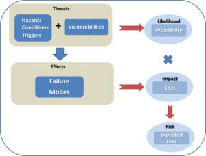
Figure 1 – Fundamental Components of Risk

Hazards, conditions and triggers are situations that increase or cause the likelihood of an adverse event (sometimes referred to as a peril). In our last article, we examined numerous sources of hazards that can threaten a supply chain. Vulnerabilities are factors that can make a system, in our case a supply chain, susceptible to hazards.  They are usually weaknesses that can be compromised by a hazardous condition, resulting in a threat. The likelihood, or probability, of a threat circumstance occurring must be considered, for reasons discussed above. If it occurs, failures can take place, whose effects are quantified as impacts. When impacts are weighed against the likelihood of the threat, the result is a risk that poses an expected loss. Controls are countermeasures that a firm can use to offset expected losses.

With respect to a supply chain, there are many ways to classify risk. Academics have made many attempts to try to classify risks according to some kind of ontology or framework (Harland, Brenchley and Walker 2003) (Gupta, Kumar Sahu and Khandelwal 2014) (Tummala and Schoenherr 2011) (Peck 2005) (Monroe, Teets and Martin 2012) (Chopra and Sodhi 2004). Some of the more common supply chain risk classifications include:

Recurring risks – These risks arise within the operational environment due to the inability to match supply and demand on a routine basis. The ensuing effects are lower service levels and fill rates.

Disruptive risk – These risks result from loss of supply or supplier capacity, typically driven by some disruptive event.

Exogenous risk – These risks arise within the operational environment and are process driven (e.g. poor quality control, design flaws, etc.), usually within the direct influence of the firm. They typically require the use of preventive mechanisms for control.

Endogenous risk – These risks originate externally, either from the supply side or demand side, which may not necessarily be under a firm’s direct influence. They typically involve the use of responsive mechanisms for control.

While many classification attempts have been noble in nature, in the end it is difficult to classify risks according to a single scheme, for a variety of reasons. First, the lines of demarcation between risk categories can be blurred and there could be overlap between them. For example, from the above categories, one can easily argue about the differences between exogenous and recurring risks. Second, every firm is different, and thus one framework may not fit all. Finally, risk methodology approaches may differ somewhat across various industries, as evidenced by different industry best practices and standards for risk analysis.

Supply chains can exhibit many kinds of vulnerabilities, but quite often these can be viewed as either structural or procedural in nature. Structural vulnerabilities stem from deficiencies in how the supply chain is organized, provisioned and engineered. Single points of failure can arise when there is insufficient diversity across suppliers, product sources or the geographical locations of sources. Inadequate provisioning can create shortages in inventory or capacity to meet customer demands. Procedural vulnerabilities stem from deficiencies in business or operational processes. Gaps and oversights in planning, production or transport processes could adversely affect a firm’s ability to respond to customer needs. Insufficient supply chain visibility could render a firm blind to oversights in supplier vetting and management practices, quality assurance and control, or demand planning.

Such kinds of vulnerabilities, combined with an aforementioned hazardous condition, results in the supply chain failing in some fashion. Table 1 illustrates some of the more common modes of supply chain failure.

Table 1 – Common Supply Chain Failure Modes

Degraded fill rate

Degraded service level

High variability of consumption

Higher product cost

Inaccurate forecasts

Inaccurate order quantity

Information distortion

Insufficient order quantities

Longer lead times/delays

Loss of efficiency

Lower process yields

Operational disruption

Order fulfillment errors

Overstocking/understocking

Poor quality supplied

Supplier stock out


Ultimately, such supply chain failures result in increased costs, loss of revenue, loss of assets, or combination thereof. Common risks are typically assessed as increases in ordering costs, product costs, or safety stock costs. Product stock out losses can be assessed as backorder costs or loss of sales and business revenue. Different kinds of firms will be prone to different types of risks. For example, a manufacturing firm with long supply chains will be more susceptible to ordering variability (or bullwhip) types of effects versus a shorter retail supply chain which would be more sensitive to fill rate and service level variability. Understanding and characterizing these risks is necessary in order to develop strategies to control or manage them. Quantifying risks provides the decision maker with a gauge to assess risk before and after a control is applied, thereby assessing the prospective benefit of a potential control. Using quantified risk values, in combination with other parameters, enables a decision maker to prioritize potential control strategies according to their cost-effectiveness.

Conclusions

Risk is the chance or the probability of a loss or unwanted negative consequence. Inherent supply chain weaknesses such as sole sourcing, process gaps or lack of geographical sourcing diversity can render a supply chain more vulnerable to some hazardous, unforeseen condition or trigger event, such as a strike or major storm, resulting in undesirable increases in costs, asset loss or revenue loss. Such risks can be quantified to some extent, quite often in monetary units, and can be used to facilitate cost-benefit analysis of potential control strategies. In our next article, we will take a look some of the most favored strategies to control supply chain risk.

AmickBrown.com

Bibliography

Chopra, S., and M. Sodhi. “Managing Risk to Avoid Supply-Chain Breakdown.” MIT Sloan Management Review, 2004: 53-61.

Gupta, G., V. Kumar Sahu, and A. K. Khandelwal. “Risks in Supply Chain Management and its Mitigation.” IOSR Journal of Engineering, 2014: 42-50.

Harland, C., R. Brenchley, and H. Walker. “Risk in Supply Networks.” Journal of Purchasing & Supply Management, 2003: 51-62.

Monroe, R. W., J. M. Teets, and P. R. Martin. “A Taxonomy for Categorizing Supply Chain Events: Strategies for Addressing Supply Chain Disruptions.” SEDSI 2012 Annual Meeting Conference Proceedings. Southeast Decision Sciences Institute, 2012.

Peck, H. “Drivers of Supply Chain Vulnerability.” International Journal of Physical Distribution & Logistics Management, 2005: 210-232.

Tummala, R., and T. Schoenherr. “Assessing and Managing Risks Using the Supply Chain Risk Management Process (SCRMP).” Supply Chain Management: An International Journal, 2011: 474-483.


10 Data Visualizations You Need to Know Now

word cloud predictive dataNo one likes reading through pages or slides of stats and research, least of all your clients. Data visualizations can help simplify this information not only for them but you too! These ten different data visualizations will help you present a wide range of data in a visually impactful way.

1.Pie Charts and Bar Graphs—The Usual Suspects for Proportion and Trends

New to data visualization tools? Start with the traditional pie chart and bar graph. Though these may be simple visual representations, don’t underestimate their ability to present data. Pie charts are good tools in helping you visualize market share and product popularity, while bar graphs are often used to compare sales revenue over the years or in different regions. Because they are familiar to most people, they don’t need much explanation—the visual data speaks for itself!

2.Bubble Chart—Displaying Three Variables in One Diagram

When you have data with three variables, pie charts and bar graphs (which can only represent two variables at the most) won’t cut it. Try bubble charts, which are generally a series of circles or “bubbles” on a simple X-Yaxis graph. In this type of chart, the size of the circles represents the third variable, usually size and quantity.

For example, if you need to present data on the quantity of units sold, the revenue generated, and the cost of producing the units, use a bubble chart.  Bubble charts immediately capture the relationship between the three variables and, like line graphs, can help you identify outliers quickly. They’re also relatively easy to understand.

3.Radar Chart—Displaying Multiple Variables in One Diagram

For more than three variables in a data set, move on to the radar chart. The radar chart is a two-dimensional chart shaped like a polygon with three or more variables represented as axes that start from the same point.

Radar charts are useful for plotting customer satisfaction data and performance metrics. Primarily a presentation tool, they are best used for highlighting outliers and commonalities, as radar charts are able to simplify multivariate data sets.

4.Timelines—Condensing Historical Data

Timelines are useful in depicting chronological data. For example, you can use it to chart company milestones, like product launches, over the years.

Forget the black and white timelines in your history textbooks with few dates and events charted. With simple tools online, you can add color and even images to your timeline to accentuate particular milestones and other significant events. These additions not only make your timeline more visually appealing, but easier to process too!

5.Arc Diagrams—Plotting Relationships and Pairings

The arc diagram utilizes a straight line and a series of semicircles to plot the relationships between variables (represented by nodes on the straight line), and helps you to visualize patterns in a given data set.

Commonly used to portray complex data, the number of semicircles within the arc diagram depends on the number of connections between the variables. Arc diagrams are often used to chart the relationship between products and their components, social media mentions, and brands and their marketing strategies. The diagram can itself be complex, so play around with line width and color to make it clearer.

6.Heat Map—For Distributions and Frequency in Data

First used to depict financial market information, the heat map has nothing to do with heat but does display data “intensity” and size through color. Usually utilizing a simple matrix, the 2D area is shaded with different colors representing different data values.

Heat maps are not only used to show financial information, but web page frequency, sales numbers and company productivity as well. If you’ve honed your data viz skills well enough, you can even create a heat map to depict real time changes in sales, the financial market, and site engagement!

7.Chloropleth and Dot Distributions Maps—For Demographic and Spatial Distributions

Like heat maps, chloropleths and dot distribution maps use color (or dots) to show differences in data distribution. However, they differ from heat maps because they’re specific to geographical boundaries. Chloropleths and dot distribution maps are particularly useful for businesses that operate regionally or want to expand to cover more markets, as it can help present the sales, popularity, or potential need of a product to the client in compelling visual language.

8.Time Series—Presenting Measurements over Time Periods

This looks something like a line graph, except that the x-axis only charts time, whether in years, days, or even hours. A time series is useful for charting changes in sales and webpage traffic. Trends, overlaps, and fluctuations can be spotted easily with this visualization.

As this is a precise graph, the time series graph is not only good for presentations (you’ll find many tools to help you create colorful and even dynamic time series online), it’s useful for your own records as well. Professionals both in business and scientific studies typically make use of time series to analyze complex data.

9.Word Clouds—Breaking Down Text and Conversations

It may look like a big jumble of words, but a quick explanation makes this a strong data visualization tool. Word clouds use text data to depict word frequency. In an analysis of social media mentions, instead of simply saying “exciting” has been used x number of times while “boring” has been used y number of times, the word that is used most frequently appears the largest, and the word that hardly appears would be in the smallest font.

Word clouds are frequently used in breaking down qualitative data sets like conversations and surveys, especially for sales and branding firms.

10.Infographics—Visualizing Facts, Instructions and General Information

Infographics are the most visually appealing visualization on this list, but also require the most effort and creativity. Infographics are a series of images and text or numbers that tell a story with the data. They simplify the instructions of complex processes, and make statistical information easily digestible. For marketers, infographics are a popular form of visual content and storytelling.

Get more information on building charts, graphs and visualization types.

– See more at: http://blog-sap.com/analytics/2016/07/11/10-data-visualizations-you-need-to-know-now/#sthash.UXqH0lkE.dpuf

Get a Reporting, Analytics, and Planning Edge with Allevo

Allevo signet

By Gunnar Steindorsson

Success Story –  global manufacturer with multiple lines of business and dozens of facility locations .

With Allevo, they reduced their planning cycle time by 60-65% by eliminating steps that were not adding value. Time previously spent on tedious data extraction, transformation, loading and reconciliation was now available for more value-add analysis and optimization efforts.

Moreover, better data quality and timeliness has improved reporting, allowing for better analysis and insight, which ultimately boosts overall business performance. By managing what matters, the result is measureable and valid to your business.

Success Story Food & Beverage Conglomerate –

The results achieved covered both a cycle time reduction of over 50% as well as significant improvement to data and process quality. As a result, this customer was able to move from annual to quarterly – and in some areas monthly – planning, since Allevo’s real-time bi-directional integration with SAP eliminated the lengthy and cumbersome ETL process.

This real-time integration also allows planners to see how certain changes affect the results in financial statements, something that was impossible before. Planners now have the ability to create multiple budgets quickly and can model scenarios with different underlying assumptions.

Finally, Allevo was able to provide the flexible reporting needed to cover the needs of all eight business units as well as satisfy some pretty tricky legal and regulatory requirements.


Allevo read write white

The Reporting , Analytics, and Planning Edge

Over 64,000 companies rely on SAP to manage their business operations, making it the most widely used ERP platform in the world. If you work in finance for one of these companies, you know how powerful and effective SAP is. If your role includes budget planning and forecasting, you can also attest to how difficult and painful this process can be in SAP. A transactional system, SAP can make it difficult to aggregate and consolidate data, create projections, and deliver views able to provide the insight needed for effective analysis and decision-making. Moreover, the system can be very inflexible and its user interface far from intuitive.

This is where Allevo comes in. Allevo takes the tedium out of complex budgeting, reporting and analytics processes, allowing professionals to work within their familiar planning environment – such as Excel worksheet – while providing real-time access to all business data within SAP. An enterprise-level budget planning, forecasting, and reporting solution, Allevo integrates directly with SAP to provide planners with easy access to all data needed for effective planning and controlling.

Far more than just a data integration tool, however, Allevo also provides well-structured processes and workflows so users can keep track of budgeting processes and efficiently map even complex budgeting structures.  Thanks to the optimization Allevo provides,

  • decision makers are better informed,
  • the workload of the planning team is greatly reduced, and
  • the overall data and analysis quality vastly improves. Allevo - Smart Financials

Risk-Free Trial

Confident in our  technology and value proposition, Allevo offers prospective clients not only customized demos but also a one-day workshop and 60-day trial of their solution free of charge. This makes the decision for Allevo virtually risk-free since clients can test the software in their own environment, using their own data, processes, and planning worksheets to ensure it meets their needs before they commit to a purchase.

Ready for More Information ?  Contact Us

AmickBrown.com

The Human Aspect of Predictive Analytics

By Ashith Bolar , Director AmBr Labs, Amick Brown

The past decade and a half has seen a steady increase in Business Intelligence (BI). Every company boasts a solid portfolio of BI software and applications. The fundamental feature of BI is Data Analytics. Corporations that boasts large data do indeed derive a lot of value from their Data Analytics. A natural progression of Data Analytics is Predictive Analytics (PA).

Think of data analytics as a forensic exercise in measuring the past and the current state of the system. Predictive Analytics is the extension of this exercise: Instead of just analyzing the past and evaluating the current, predictive analytics applies that insight to determine, or rather shape the future.

Predictive Analytics is the natural progression of BI.

The current state of PA in the general business world is, for the most part, at its inception. Experts in the field talk about PA as the panacea – as the be-all and end-all solution to all business problems. This is very reminiscent of the early stages of BI towards the turn of the century. Hype as it may be, BI did end up taking the center stage over the ensuing years. BI was not the solution to the business problems anymore; it was indeed mandatory for the very survival of a company. Companies don’t implement BI to be on the leading-edge of the industry anymore. They implement BI just to keep up. Without BI, most companies would not be competitive enough to survive the market forces.

Very soon, PA will be in a similar state. PA will not be the leading-edge paradigm to get a headstart over other companies. Instead PA is what you do to just survive. All technologies go through this phase transition – from leading-edge to must-have-to-survive. And PA is no different.

predict the future

Having made this prediction, let’s take a look at where PA stands. Some industries (and some organizations) have been using predictive analytics for several decades. One such not-so-obvious example is the financial industry. The ubiquity of FICO scores in our daily lives does not make it obvious, but they are predictive analytics at work. Your fico score predicts, with a certain degree of accuracy, the likelihood of you defaulting on a loan. A simple number, that may or may not be accurate in individual cases, arguably has been the fuel to the behemoth economic machinery of this country, saving trillions of dollars for the banking industry as well as the common people such as you and me.

Another example would be that of the marketing departments of large retail stores. They have put formal PA to use for several years now, in a variety of applications such as product placement, etc. If it works for them, there is no reason it should not work for you.

This is easier said than done. Implementing Predictive Analytics is not a trivial task. It’s not like you buy a piece of software from the Internet, install it on a laptop, and boom – you’re predicting the future. Although I have to admit that that is a good starting point. Implementing the initial infrastructure for PA does require meticulous planning. It’s a time-consuming effort, but at this point in time, a worthy effort.

Let’s take a look at high-level task list for this project

  1. Build the PA infrastructure
  2. Choose/build predictive model(s)
  3. Provision Data
  4. Predict!
  5. Ensure there’s company-wide adoption of the new predictive model. Make PA a key part of the organization’s operational framework. Ensure that folks in the company trust the predictive model and not try to override it with their human intelligence.

Steps 1 thru 4 are the easy bits. It’s the 5th step that requires a significant effort.

Most of us have relied on our superior intellect when it comes to making serious decisions. And most of us believe that such decision-making process yields the best decisions. It is hard for us to imagine that a few numbers and a simple algorithm would yield better decisions than those from the depths of our intellect.

However, it is important to change your organization’s mindset about predictive analytics. If you are considering your business to be consistently run on mathematical predictive models, acceptance from the user community is crucial. Implementing PA is a substantial effort in Organizational Change Management.

Remember the financial services industry. They don’t let their loan officers make spot decisions on the loan-eligibility of their clients based on their appearance, style of speech or any such human sensory cues. Although, if you ask the loan officer, they might claim to be better judges of character – the financial industry does not rely on their superior human intellect to measure the risk of loan default. Generally, a single 3-digit number makes that decision for them.

The next time you go to the supermarket for a loaf of bread, and return with a shopping cart full of merchandise that you serendipitously found on the way back from the bread aisle including the merchandise along the cash-counter, you can thank (or curse) the predictive analytics employed by the store headquarters located probably a thousand miles away from you.

AmickBrown.comGet What You Expect

4 Best Practices to make your Storyboards more Dynamic and Appealing

By Iver van de Zand  – Business Intelligence & Analytics – SAP – Visualization – DataViz – Evangelist – Author of “Passionate On Analytics”

Your end users will love it when you’d deliver your story- and dashboards in a more appealing and dynamic way. In these Let Me Guide series I discuss 4 easy to use best practices that will help you doing so:

  1. Using backgrounds

  2. Using Navigation

  3. dynamic Vector Diagram pictures: SVG

  4. Dynamic Text

Using Background

Backgrounds can better the looks and experience of story- and dashboards. Use the opacity to ensure the attention is not too much distracted from the actuals graphs and charts. I tends to create my backgrounds myself using PowerPoint: create a slide with a layout you like allocating space for KPI metrics and visualizations. Save the slide as JPG which you can import as background into SAP Lumira.

Using Navigation 

If you have story- or dashboards with multiple pages, my experience is that custom navigation buttons help you users finding what they should read. I use custom navigation all the time on my storyboard’s landing pages for example. Here is how you do it:

  •  Find a shape or picture that you want to use as clickable button and save it as xx.jpg

  • Import xx.jpg as picture in Lumira and drop it on your storyboard where you want it

  • Drag and drop a rectangle shape exactly over you newly created button and set its lines and fill-color both to “none”

  • Click you “invisible” shape and add the URL or page number to it

  • Save and preview

Example landing page B

example of navigation buttons

Example landing page A

Example landing page A

Example of a core layout of a landing page for your storyboard. The color-coded tiles can be used as navigation buttons. The generic tiles act to show key metrics info. Save the core lay-out as JPG and use this JPG as core background in your storyboard. Now add an object over the color coded sections, make it invisible and add a page-link to the appropriate page in your story.

SVG files

Especially infographics gain on weight and meaningfulness if you use dynamic pictures as part of your charts and graphs. Bar- and line charts in SAP Lumira have the possibility to change its regular column and markers into a dynamic pictogram. You can use the embedded pictograms but also add your own. The pictograms need to be in the SVG dynamic vector format. Search for pictures on Google with the “ filetype:SVG” string to find SVG’s. Save and import them to Lumira and change the graphs properties. The results are impressive. It is easy to create your own SVG files: I use PowerPoint to create my own pictures and save them to JPG. Using conversion tools easily creates an SVG that you can use as dynamic chart/graph picture in your storyboards.

Dynamic Text

Dynamic Text is a powerful way to improve context sensitive messaging in your story- and dashboards. The dynamic text is based on a dataset attributes and thus changes when data is refreshed are filtered. Since SAP Lumira handles the dynamic text as any other attribute, you can also apply formulas against the text.

Brainteaser: Storyboard or Dashboard…Self-Service or Managed…you choose

By Iver Van de Zand, SAP

If there is one term that always is food for discussion when I talk to customers, it is definitely “dashboard”. What exactly is a dashboard, how close is it to a storyboard, are dashboard only on summarized data and when to use a dashboard versus a storyboard. Tons of questions that already start in a bad shape because people have other perceptions of what a dashboard really is. And let’s be honest; take a canvas, put a few pies on it and a bar-chart, and people will already mention it as a dashboard. Let’s see whether we can fine-tune this discussion a bit.

A Dashboard

A business intelligence dashboard is a data visualization technique that displays the current status and/or historical trends of metrics and key performance indicators (KPIs) for an enterprise. Dashboards consolidate and arrange numbers, metrics and sometimes performance scorecards on a single screen. They may be tailored for a specific role and display metrics targeted for a single point of view or department. The essential features of a BI dashboard product include a customizable interface and the ability to pull real-time data from multiple sources. The latter is important since lots of people think dashboards are only on summarized data which is absolutely not the case; dashboards consolidate data which may be of the lowest grain available! Key properties of a dashboard are:

  1. Simple and communicates easily and straight

  2. Minimum distractions, since these could cause confusion

  3. Supports organized business with meaning, insights and useful data or information

  4. Applies human visual perception to visual presentation of information: colors play a significant role here

  5. Limited interactivity: filtering, sorting, what-if scenarios, drill down capabilities and sometimes some self-service features

  6. They are often “managed” in a sense that the dashboards are centrally developed by ICT, key users or a competence center, and they are consumed by the end-users

  7. Offer connectivity capabilities to other BI components for providing more detail. Often these are reports with are connected via query-parsing to the dashboards

A Storyboard

Is there a big difference between a storyboard and a dashboard? Mwah, not too much: they both focus on communicating key – consolidated – information in a highly visualized and way which ultimately leaves little room for misinterpretation. For both the same key words apply: simple, visual, minimum distraction.

The main difference between a dashboard and a storyboard is that the latter is fully interactive for the end user. The interactivity of the storyboard is reflected through capabilities for the end user to:

  • Sort

  • Filter data: include and exclude data

  • Change chart or graph types on the fly

  • Add new visualizations on the fly; store and share them

  • Drill down

  • Add or adjust calculated measures and dimensions

  • Add new data via wrangling, blending or joining

  • Adjust the full layout of the board

  • Create custom hierarchies or custom groupings

  • Allow for basic data quality improvements (rename, concatenate, upper and lower case etc)

Another big difference between dashboards and storyboards is that storyboards are self-service enabled boards meaning the end user creates them him/herself. Opposite to dashboards that are typically “managed” and as such are created centrally by ICT, key users or a BICC, and are consumed by the end user.

A Dashboard versus a Storyboard

So your question, dear reader, is “what is the day-to-day difference and what to you use when”? Well the answer is in the naming of both boards:

The purpose of a storyboard is to TELL A STORY: the user selects a certain scope of data (which might be blended upon various sources) and builds up a story around that data that provides insights in it from various perspectives. All in a governed way of course. The story is built upon various visualizations that are grouped together on the canvas of the storyboard. These visualizations can be interdependent – filtering on one affects the others – or not. The canvas is further enriched with comments, text, links or dynamic pictures … all with the purpose to complete the story.

Storyboarding has dramatically changed day-to-day business: the statement “your meeting will never be the same” applies definitely. Your meetings are now being prepared by creating a storyboard; meetings are held using storyboards to discuss on topics and make funded decisions, simulations on alternative decisions are done during the meetings using the storyboards and final conclusions can be shared via the storyboards. Governed, funded, based on real-insights!

A dashboard has a pattern of analyzing that is defined upfront. It is about KPI’s or trends of a certain domain, and you as a user consume that information. You can filter, sort or even drill down in the data, but you cannot change the core topic of data. If the KPI’s are on purchasing information, it is on purchasing information and stays like it. You neither can add data to compare it.

In a number of situations one does not want the end user to “interact” with the information since it is corporate fixed data that is shared on a frequent and consistent time. Enterprises want that information to be shared for insights in a consistent, regular and recognizable way. Users will recognize the dashboard, consume the information and – hopefully – act upon it. Think for example about weekly or monthly performance dashboards, or HR dashboards that provide insights in attrition on recurring moments in time.

Dashboards and Storyboards: the “SAP way”

The nuances made above on dashboards and storyboards are being reflected in SAP’s Business Intelligence Suite. Its component Design Studio is a definite managed dashboarding tool. Extremely capable of visualizing insights in a simple and highly attractive way while in the meantime able to have online connections to in-memory data sources, SAP BW or semantic layers. Storyboarding is offered via the on-premise SAP Lumira or via Cloud through the Cloud for Analyticscomponent.

If you have difficulties deciding what to offer to your end users, the BI Componentselection tool I made easily helps you understanding whether your users require dashboards or/and storyboards. You might want to try it.

Financial storyboard

Financial storyboard

Self-service storyboard created in around 45 minutes using SAP Lumira. On this page the heat-map section that allows for white spot analyses. Data can be exported at any time. User has numerous capabilities to add data, visualizations and additional pages

Retailing Dashboard

Financial storyboard

Financial storyboard

Self-service storyboard created in around 45 minutes using SAP Lumira. User has numerous capabilities to add data, visualizations and additional pages

Predictive Analytics 101 – The Real Business Intelligence, part 2

by Ashith Bolar,  Director AmBr Data Labs @ Amick Brown

In my first post, “The Real Business Intelligence” ,  I emphasized on the significance of Predictive Analytics in the Business Intelligence space.  Let us take a deeper look at Predictive Analytics by way of more concrete examples.

As a refresher, Predictive Analytics is a set of tools and techniques based on statistical and mathematical techniques to analyze historical data and subsequently predict the future. The basic premise is that by analyzing historical data, determining relationships, more specifically correlations between related (and sometimes seemingly unrelated) attributes and entities, one can derive significant insights into a system. These insights can be further used to make predictions.

Let’s take a look at this process step by step.

The fundamental component in Predictive Analytics is a Predictive Model, or just model. A Predictive Model is set of data points plus a series of algorithms working on that data. It attempts to capture the relationships between the data points by means of applying mathematical or statistical computations deployed as algorithms.

The output of a model is typically a single number — called a score. The score essentially is an quantitative value for a specific prediction by the model based on historical data. Higher the score, the more likely a certain behavior is predicted. Lower the score, the more likely the opposite behaviour is predicted.

Predictive models can be built for a wide variety of problems. But the most common predictive models, especially in the context of a business application, is one that predicts people’s behaviors. Predictive models are designed to predict how people behave under new circumstances, given what we know about how they behaved in the past with other known circumstances. For instance, Netflix’s movie recommendations — based on the movies that you have seen and rated highly (known circumstances) recommendations for new movies (unknown circumstances) are generated.

You will hear terms like “Machine Learning”, “Artificial Intelligence”, “Regression Analysis”, etc. While, each one is an independent area of mathematics and computing, for a Predictive Analytics suite, these are just different algorithms (computing models) that are employed in the process of predicting.

Let’s dig deeper into the concept of Scores. Let’s take two classical examples of scores generated on customers.

  1. Based on the movies you have seen and rated in the past, Netflix tries to determine if you will like a new movie or not. Say for instance, a scoring of 0-10: 10 being a prediction of you absolutely loving the new movie, and 0 being a prediction of you absolute not caring about it. This type of a score is called a Probability Score. In essence, the score tells you the probability of you liking a movie.
  2. Another type of score is called the Quantitative Score. Here the prediction is not the probability of whether you will like the movie or not, instead to quantitatively predict the amount of something. For instance, Life Insurance companies try to predict how long a certain customer will live based on the life choices and other circumstances of the customer.

In case of the Netflix model (Probability Score), if a customer gets a 8 (out of 10) for the likelihood of liking a particular movie, it can be rephrased as “There’s a 80% chance that the customer will like this movie, and a 20% chance that they will not like it”. Such a prediction is basing its prediction on the spread of probabilities (probability distribution). Another way of looking at this score of 8 (out of 10 is) “The customer might not absolutely love this movie (which would be a 10/10), but definitely not absolutely hate the movie (0/10). Instead the customer is more likely actually liking the movie to some extent (8/10), rather than completely disinterested (5/10).

In either case, a careful examination of this score tells us that all the system is doing is categorizing people’s behaviours into a set number of ranks. Therefore, predictive models which generate probability scores are usually called classification models. On the other hand, the quantitative scoring (predicted life expectancy of an insurance customer) is really a quantitative number. Another classic example is customer spend which is how much a customer is willing to pay for a new product or service. The actual value is reached at by means of various statistical and mathematical computations. These models are typically known as regression models.

A good predictive model might not be accurate in every single case, but given a large set of data (read target customers), the model regresses to the predicted mean of the behavior.

In the following posts, we will delve deeper into predictive algorithms, and try to gain a better understanding of how they work, and more importantly why they work, and why they are important in your corporate strategy.