Category Archives: SAP

Get a Reporting, Analytics, and Planning Edge with Allevo

Allevo signet

By Gunnar Steindorsson

Success Story –  global manufacturer with multiple lines of business and dozens of facility locations .

With Allevo, they reduced their planning cycle time by 60-65% by eliminating steps that were not adding value. Time previously spent on tedious data extraction, transformation, loading and reconciliation was now available for more value-add analysis and optimization efforts.

Moreover, better data quality and timeliness has improved reporting, allowing for better analysis and insight, which ultimately boosts overall business performance. By managing what matters, the result is measureable and valid to your business.

Success Story Food & Beverage Conglomerate –

The results achieved covered both a cycle time reduction of over 50% as well as significant improvement to data and process quality. As a result, this customer was able to move from annual to quarterly – and in some areas monthly – planning, since Allevo’s real-time bi-directional integration with SAP eliminated the lengthy and cumbersome ETL process.

This real-time integration also allows planners to see how certain changes affect the results in financial statements, something that was impossible before. Planners now have the ability to create multiple budgets quickly and can model scenarios with different underlying assumptions.

Finally, Allevo was able to provide the flexible reporting needed to cover the needs of all eight business units as well as satisfy some pretty tricky legal and regulatory requirements.


Allevo read write white

The Reporting , Analytics, and Planning Edge

Over 64,000 companies rely on SAP to manage their business operations, making it the most widely used ERP platform in the world. If you work in finance for one of these companies, you know how powerful and effective SAP is. If your role includes budget planning and forecasting, you can also attest to how difficult and painful this process can be in SAP. A transactional system, SAP can make it difficult to aggregate and consolidate data, create projections, and deliver views able to provide the insight needed for effective analysis and decision-making. Moreover, the system can be very inflexible and its user interface far from intuitive.

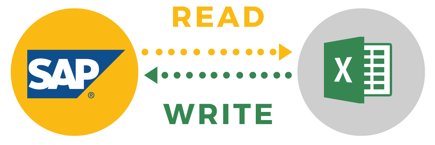
This is where Allevo comes in. Allevo takes the tedium out of complex budgeting, reporting and analytics processes, allowing professionals to work within their familiar planning environment – such as Excel worksheet – while providing real-time access to all business data within SAP. An enterprise-level budget planning, forecasting, and reporting solution, Allevo integrates directly with SAP to provide planners with easy access to all data needed for effective planning and controlling.

Far more than just a data integration tool, however, Allevo also provides well-structured processes and workflows so users can keep track of budgeting processes and efficiently map even complex budgeting structures.  Thanks to the optimization Allevo provides,

  • decision makers are better informed,
  • the workload of the planning team is greatly reduced, and
  • the overall data and analysis quality vastly improves. Allevo - Smart Financials

Risk-Free Trial

Confident in our  technology and value proposition, Allevo offers prospective clients not only customized demos but also a one-day workshop and 60-day trial of their solution free of charge. This makes the decision for Allevo virtually risk-free since clients can test the software in their own environment, using their own data, processes, and planning worksheets to ensure it meets their needs before they commit to a purchase.

Ready for More Information ?  Contact Us

AmickBrown.com

SAP Business Suite 4 SAP HANA – Let’s Start at the Beginning

by Ashith Bolar, Director AmBr Labs, Amick Brown

Every week at Amick Brown, we are questioned about HANA There is a lot of confusion in the market with the multiple options. As well, there are many questions about timing and business application. You have asked, so we will start a series of HANA articles to address your questions.

grow blue suit

SAP Business Suite 4 SAP HANA, shortened to SAP S/4HANA,  is a big strategic play from SAP. Here is why you need to take heed.

The new SAP S/4HANA is supposed to replace the SAP Business Suite (formerly R/3) over the next few years. This announcement and the launch of the software lay a roadmap for SAP in the coming years.

What led to this launch?

SAP is a leader in ERP worldwide. However, in the recent past, a new trend is taking over in the business world. Cloud-based software services also known as Software-as-a-Service. SAP has SaaS components to it, but its main business model has been selling software the old way: software installed at the customers’ premise.

Other cloud companies  have been slowly chipping away at SAP’s market share. And this is SAP’s answer.

Name

The R in R/3 stood for real-time. The S in the S/4 stands for Simple. This is the big idea. SAP is planning on simplifying the ERP system with this release.

Database

While SAP R/3 Business Suite ran on any database, S/4 runs exclusively on HANA. SAP has spent considerable financial resources and effort on building up the in-memory database over the past few years. SAP HANA has tremendous performance advantages compared to the older disk-based database solutions. This large-scale change has enabled SAP to dramatically simplify both the data-model as well as the user-experience.

One significant aspect of HANA is that it is an in-memory appliance. This means data-access times (disk read/writes) are not an issue anymore, allowing developers to focus more on business logic than performance. This lends itself to the other motivation for S/4 – simplicity.

The Cloud

SAP S/4HANA is mostly a movement of SAP’s premier software from customer premise to the cloud. However, on-premise solutions will still be available. SAP offers 3 options:

  1. Public Cloud – Completely managed by SAP. Multi-tenancy shared by all public cloud customers
  2. Private Cloud – Partially managed by SAP. Exclusive database per customer.
  3. On-Premise – Software installed on client’s hardware. Client pays for user-licenses.

Software

SAP S/4HANA will allow customization to S/4HANA on the HANA Cloud Platform (HCP). This means ABAP developers will get to continue to use their skills. If you don’t know OO, it is a good time to learn it.

UI

Let’s admit it, SAP R/3 has not been known for its stellar user-experience. UI on SAP R/3 has been clunky, rigid and unwelcoming. But the S/4HANA user-interface will be based on SAP’s Fiori UX platform. SAP Fiori, launched earlier in 2014, gives the software a new look-and-feel. The fact it does not have licensing cost should make it attractive to customers with an existing SAP installation.

Conclusion

Co-founder, Hasso Plattner said “If this doesn’t work, we’re dead. Flat-out dead.” This may be just Hasso Plattner being the passionate visionary that he is. But this indeed is a huge launch from SAP, one whose initial roll out is expected to be 3-5 years, and customer transitions lasting more 10 years.

The story on S/4 HANA continues here.  Watch this space and Follow Amick Brown on LinkedIn

Reimagine Predictive Analytics for the Digital Enterprise

future_predictive_analytics_SAPPHIRENOW

As part of a broad announcement made at SAPPHIRE NOW 2016, SAP announced a range of new features and capabilities in its analytics solutions portfolio. Because predictive capabilities play an important role in the portfolio, I thought I’d take this opportunity to share the details of our innovations in both SAP BusinessObjects Cloud and SAP BusinessObjects Predictive Analytics.

Innovations in SAP BusinessObjects Cloud

Predictive analytics capabilities have been added to the SAP BusinessObjects Cloud offering. Business users can use an intuitive graphical user interface to investigate business scenarios by leveraging powerful built-in algorithmic models. For example, users can perform financial projections with time series forecasts, automatically identify key influencers of operational performance, and determine factors impacting employee performance with guided machine discovery.

Learn more about our predictive capabilities in SAP BusinessObjects Cloud.

Innovations in SAP BusinessObjects Predictive Analytics

Predictive analytics features that aim to help analysts easily deliver predictive insights across an enterprise’s business processes and applications are planned for availability in the near term.

Planned innovations include:

  • Automated predictive analysis of Big Data with native Spark modeling in Hadoop environments
  • Enhancements for SAP HANA including in-database social network analysis and embedding expert model chains
  • A new simplified user interface for the predictive factory and automated generation of segmented forecast models
  • Integration of third-party tools and external processes into predictive factory workflows
  • The ability to create and manage customized models that detect complex fraud patterns for the SAP Fraud Management analytic application

Learn more about what SAP Predictive Analytics has in store.

Upcoming Release of SAP Predictive Analytics

Watch the video about our upcoming release of SAP Predictive Analytics for more information.

Thank you to Pierre Leroux, Director, Predictive Analytics Product Marketing, SAP for writing this informative article.

AmickBrown.com


4 Best Practices to make your Storyboards more Dynamic and Appealing

By Iver van de Zand  – Business Intelligence & Analytics – SAP – Visualization – DataViz – Evangelist – Author of “Passionate On Analytics”

Your end users will love it when you’d deliver your story- and dashboards in a more appealing and dynamic way. In these Let Me Guide series I discuss 4 easy to use best practices that will help you doing so:

  1. Using backgrounds

  2. Using Navigation

  3. dynamic Vector Diagram pictures: SVG

  4. Dynamic Text

Using Background

Backgrounds can better the looks and experience of story- and dashboards. Use the opacity to ensure the attention is not too much distracted from the actuals graphs and charts. I tends to create my backgrounds myself using PowerPoint: create a slide with a layout you like allocating space for KPI metrics and visualizations. Save the slide as JPG which you can import as background into SAP Lumira.

Using Navigation 

If you have story- or dashboards with multiple pages, my experience is that custom navigation buttons help you users finding what they should read. I use custom navigation all the time on my storyboard’s landing pages for example. Here is how you do it:

  •  Find a shape or picture that you want to use as clickable button and save it as xx.jpg

  • Import xx.jpg as picture in Lumira and drop it on your storyboard where you want it

  • Drag and drop a rectangle shape exactly over you newly created button and set its lines and fill-color both to “none”

  • Click you “invisible” shape and add the URL or page number to it

  • Save and preview

Example landing page B

example of navigation buttons

Example landing page A

Example landing page A

Example of a core layout of a landing page for your storyboard. The color-coded tiles can be used as navigation buttons. The generic tiles act to show key metrics info. Save the core lay-out as JPG and use this JPG as core background in your storyboard. Now add an object over the color coded sections, make it invisible and add a page-link to the appropriate page in your story.

SVG files

Especially infographics gain on weight and meaningfulness if you use dynamic pictures as part of your charts and graphs. Bar- and line charts in SAP Lumira have the possibility to change its regular column and markers into a dynamic pictogram. You can use the embedded pictograms but also add your own. The pictograms need to be in the SVG dynamic vector format. Search for pictures on Google with the “ filetype:SVG” string to find SVG’s. Save and import them to Lumira and change the graphs properties. The results are impressive. It is easy to create your own SVG files: I use PowerPoint to create my own pictures and save them to JPG. Using conversion tools easily creates an SVG that you can use as dynamic chart/graph picture in your storyboards.

Dynamic Text

Dynamic Text is a powerful way to improve context sensitive messaging in your story- and dashboards. The dynamic text is based on a dataset attributes and thus changes when data is refreshed are filtered. Since SAP Lumira handles the dynamic text as any other attribute, you can also apply formulas against the text.

Predictive Analytics and the Segment of One

by Richard Mooney,                                           Product Manager, Advanced Analytics, SAP


Woman Buying Clothes --- Image by © Tim Pannell/CorbisOne of the areas that SAP is investing heavily in is the idea of providing ‘extreme customer experience’ to the ‘Segment of One.’  What does this mean for analytics? Traditionally, large enterprises split customers into multiple segments based on customer attributes that were then used to identify and classify customers.  These segments included their location, their current and potential spend, and which products and options they chose when they became a customer.

Marketers use these segments to determine which products they would market to which customers. Likewise, customer support applies different levels of service to each customer segment, and operations measures the profitability of each segment separately.

This is both highly frustrating to customers and an incredibly inefficient use of resources.

  • Every customer is different. They feel frustrated when their individual needs aren’t met, and their expectations about how they’re treated as customers are rising.
  • A one-size-fits-all approach doesn’t take into account the emerging customer acquisition and support channels that provide the potential to reduce the cost of service and market much more effectively. This includes mobiles applications, social networks, and the internet of things.
  • Because the cost of customer communication is plummeting, customers are inundated with content. They’re choosing to delete, unfollow and unsubscribe from content that doesn’t speak to them.

These same trends are opportunities. Companies are collecting far more information than ever before and the technology exists to leverage this at scale.  They no longer need to treat customers as being pure segments.  They can market to them personally, understand their likes and preferences, and give them services, all of which turns them into fans and advocates.

So How Do We Use Data to Connect to the Segment of One?

  • Make the Segment of One a corporate mandate. Communicate and service each customer as if it were a personal connection.
  • Rethink how your digital front office assets (including digital marketing, customer service and online) interact with customers to support this mandate.
  • Build a team of data scientists and data analysts to move from guesswork to data-driven decision making.
  • Build your customer communication around their analysis and deploy their work into every front office application. Measure and monitor the return on investment (ROI) from each initiative.

Done properly, this will result in happier customers and higher net promoter scores.   It also means that the data companies are collecting results in visible ROI, which improves their bottom line.

We would love to hear your thoughts on how the Segment of One will drive your data strategy.  Contact us or comment here to let us know.


Customer Analytics – Predictive at the Center of Everything You Do

crystal-ballAs we discussed earlier, digital transformation is about taking a holistic approach to transforming the customer experience in all aspects. In this way, you fundamentally create new business models where the convergence of physical and digital occurs at the highest level.

In today’s quickly changing and evolving digital marketplace, there are a few macro trends that you see.  The purchase path is not linear, customer engagement occurs through many touch points, and customers expect each interaction to be relevant and personalized.

The rules of engagement are changing and businesses are no longer the first stop for customers when they want to inform themselves.  People now turn to their networks to get information and recommendations. To meet the expectations of your customers today, you need to go beyond the traditional approach of acquiring and retaining customers.

The goal today is to deliver an amazing customer experience at every interaction so that you not only acquire and retain customers, but you also gain  customers who become your loyal fans, your outspoken advocates. This all boils down to the fundamental question,

How can I personalize every customer interaction across multiple channels in real time by analyzing Big Data?

This leads to transforming the operating models to a more customer-centric, integrated organization using data and analytics as the basis for decision making. The transformation can be started with very simple questions:

  • Who are my “best” customers?
  • Who should I target for promotion?
  • How should I vary my promotion to different customers?
  • What product should I sell at what channel and at what price?
  • How should I keep the supply and demand in absolute balance?

A series of predictive models for each one of these questions will establish a framework to manage the customer life cycle. To achieve this, you  use a variety of techniques, such as segmentation, link analysis, propensity, forecasting and more.

What do you think? We look forward to hearing from you.

See more about Amick Brown , SAP Silver Services Partner


Brainteaser: Storyboard or Dashboard…Self-Service or Managed…you choose

By Iver Van de Zand, SAP

If there is one term that always is food for discussion when I talk to customers, it is definitely “dashboard”. What exactly is a dashboard, how close is it to a storyboard, are dashboard only on summarized data and when to use a dashboard versus a storyboard. Tons of questions that already start in a bad shape because people have other perceptions of what a dashboard really is. And let’s be honest; take a canvas, put a few pies on it and a bar-chart, and people will already mention it as a dashboard. Let’s see whether we can fine-tune this discussion a bit.

A Dashboard

A business intelligence dashboard is a data visualization technique that displays the current status and/or historical trends of metrics and key performance indicators (KPIs) for an enterprise. Dashboards consolidate and arrange numbers, metrics and sometimes performance scorecards on a single screen. They may be tailored for a specific role and display metrics targeted for a single point of view or department. The essential features of a BI dashboard product include a customizable interface and the ability to pull real-time data from multiple sources. The latter is important since lots of people think dashboards are only on summarized data which is absolutely not the case; dashboards consolidate data which may be of the lowest grain available! Key properties of a dashboard are:

  1. Simple and communicates easily and straight

  2. Minimum distractions, since these could cause confusion

  3. Supports organized business with meaning, insights and useful data or information

  4. Applies human visual perception to visual presentation of information: colors play a significant role here

  5. Limited interactivity: filtering, sorting, what-if scenarios, drill down capabilities and sometimes some self-service features

  6. They are often “managed” in a sense that the dashboards are centrally developed by ICT, key users or a competence center, and they are consumed by the end-users

  7. Offer connectivity capabilities to other BI components for providing more detail. Often these are reports with are connected via query-parsing to the dashboards

A Storyboard

Is there a big difference between a storyboard and a dashboard? Mwah, not too much: they both focus on communicating key – consolidated – information in a highly visualized and way which ultimately leaves little room for misinterpretation. For both the same key words apply: simple, visual, minimum distraction.

The main difference between a dashboard and a storyboard is that the latter is fully interactive for the end user. The interactivity of the storyboard is reflected through capabilities for the end user to:

  • Sort

  • Filter data: include and exclude data

  • Change chart or graph types on the fly

  • Add new visualizations on the fly; store and share them

  • Drill down

  • Add or adjust calculated measures and dimensions

  • Add new data via wrangling, blending or joining

  • Adjust the full layout of the board

  • Create custom hierarchies or custom groupings

  • Allow for basic data quality improvements (rename, concatenate, upper and lower case etc)

Another big difference between dashboards and storyboards is that storyboards are self-service enabled boards meaning the end user creates them him/herself. Opposite to dashboards that are typically “managed” and as such are created centrally by ICT, key users or a BICC, and are consumed by the end user.

A Dashboard versus a Storyboard

So your question, dear reader, is “what is the day-to-day difference and what to you use when”? Well the answer is in the naming of both boards:

The purpose of a storyboard is to TELL A STORY: the user selects a certain scope of data (which might be blended upon various sources) and builds up a story around that data that provides insights in it from various perspectives. All in a governed way of course. The story is built upon various visualizations that are grouped together on the canvas of the storyboard. These visualizations can be interdependent – filtering on one affects the others – or not. The canvas is further enriched with comments, text, links or dynamic pictures … all with the purpose to complete the story.

Storyboarding has dramatically changed day-to-day business: the statement “your meeting will never be the same” applies definitely. Your meetings are now being prepared by creating a storyboard; meetings are held using storyboards to discuss on topics and make funded decisions, simulations on alternative decisions are done during the meetings using the storyboards and final conclusions can be shared via the storyboards. Governed, funded, based on real-insights!

A dashboard has a pattern of analyzing that is defined upfront. It is about KPI’s or trends of a certain domain, and you as a user consume that information. You can filter, sort or even drill down in the data, but you cannot change the core topic of data. If the KPI’s are on purchasing information, it is on purchasing information and stays like it. You neither can add data to compare it.

In a number of situations one does not want the end user to “interact” with the information since it is corporate fixed data that is shared on a frequent and consistent time. Enterprises want that information to be shared for insights in a consistent, regular and recognizable way. Users will recognize the dashboard, consume the information and – hopefully – act upon it. Think for example about weekly or monthly performance dashboards, or HR dashboards that provide insights in attrition on recurring moments in time.

Dashboards and Storyboards: the “SAP way”

The nuances made above on dashboards and storyboards are being reflected in SAP’s Business Intelligence Suite. Its component Design Studio is a definite managed dashboarding tool. Extremely capable of visualizing insights in a simple and highly attractive way while in the meantime able to have online connections to in-memory data sources, SAP BW or semantic layers. Storyboarding is offered via the on-premise SAP Lumira or via Cloud through the Cloud for Analyticscomponent.

If you have difficulties deciding what to offer to your end users, the BI Componentselection tool I made easily helps you understanding whether your users require dashboards or/and storyboards. You might want to try it.

Financial storyboard

Financial storyboard

Self-service storyboard created in around 45 minutes using SAP Lumira. On this page the heat-map section that allows for white spot analyses. Data can be exported at any time. User has numerous capabilities to add data, visualizations and additional pages

Retailing Dashboard

Financial storyboard

Financial storyboard

Self-service storyboard created in around 45 minutes using SAP Lumira. User has numerous capabilities to add data, visualizations and additional pages

The Art and Science of Customer Empathy in Design Thinking

SAPVoice+Art+And+Science+of+Empathy+Design+Thinking+by+Kaan+TurnaliCustomer-centric solutions demand empathy. But, how we employ this principle within design thinking is as critical—if not more—as what we do in the process.

Certain slices can be easily repeated—that’s the science part. However, not everything fits neatly into a template. More than anything else, we rely on our creativity to accurately frame a problem and discover the attached opportunity. That’s the art of customer empathy within design thinking.

In my previous post, I discussed three factors that are critical turning empathy into an obsession when developing customer-centric innovations. I want to expand on this topic and elaborate on how it can also be applied to our everyday work as well.

Customer Empathy is not Inherited or Repeated—it’s Continuously Learned

The unconditional act of projecting ourselves into our customers’ (or users’) shoes has to be unreserved. Empathy works only if we open up our nerve endings and feel what it is like to be in another’s shoes. One of the key approaches is adopting a beginner’s mindset that functions as a reset button—enabling us to experience a product or service as if it’s the first time we are using it.

In human-centered design, we use a set of tools to observe and communicate with people and better understand their journey. Empathetic listening and observation are essential during the entire design process:

  • Immersion: Place ourselves in the full experience through the eyes of the user.
  • Observation: Carefully watch and examine what people are actually doing.
  • Conversation: Accurately capture conversations and personal stories.

All three approaches require focus and precision because they typically produce different insights. To learn, we must listen more than we talk. When we observe, we disappear, rather than interfere. There is no room for sharing our opinions or selling the solution. We want facts. If we can’t understand the “why” behind an experience or problem, any assumptions about the “what” and “how” become skewed or misleading.

Our Knowledge is the Source of our Bias—Sometimes

In design, what we know can be just as detrimental as what we don’t know. One of the best examples of this reality is seen in technology projects.

Senior developers cooped up in a lab can produce very sophisticated code. These teams develop customer-facing elements based on a bias that reflects their extensive knowledge of the technology while ignoring steps considered minor from their vantage point. However, these minor steps are indispensable to users who are not necessarily tech-savvy—which may make up the majority of their customer base.

By simply leaving out parts that they consider obvious corners, these teams may not observe or attempt to live the experience through the eyes of the actual user—missing out on the opportunity to create a well-rounded, customer-centric experience.

With design thinking, we always insist on seeking untested experiences so we can capture unrefined observations that frame the details of the user journey.

“Emosurances” Influence our Perception of a Product or Service

Humans tend to react to emotional assurances (emosurances). They play a crucial role in designing a human-centered user experience—especially the user interface (UI).

For example, consider the experience with a digital process or transaction:

  • How many times do you find yourself in a state of uncertainty?
  • Do you know where you are in the process or queue?
  • Will you get an alert when it’s completed?
  • Will you abandon it because you are unsure of the next step?
  • Are you given any visual feedback, such as a progress bar?
  • If there is service interruption, do you get a notification? Is the message clear enough that it does not require further translation to understand next steps?

The scenarios are endless and apply to any user experience—digital or analog, online or in person. And even though these questions appear mechanical and a matter of UI, tackling these emosurances proactively is at the core of the empathy principle.

Bottom Line

The traditional value proposition of a product or service is a promise of particular utility value. If you get X, you will receive Y as a result of Z.

The design-thinking value proposition is a promise of core values: You want to get X because you care about Y and Z matters to you.

The actual value of the empathy principle comes from understanding our customers’ 360-degree viewpoint, especially their emotional attachments. Then, we can deliver a compelling value proposition that guides us along the innovation path. This approach enables a forward-thinking mindset that fuels a cultural shift paramount for competing on design thinking.

Stay tuned for the next installment of the Design Thinking thought leadership series!

Connect with me on Twitter (@KaanTurnali), LinkedIn and turnali.com

For more information on Design Thinking, contact our team at Amick Brown


What you should consider when embarking on an Advanced Analytics journey?

By Paul Pallath, PHD,  Chief Data Scientist & Director Advanced Analytics, SAP

In my previous Predictive blog, I introduced four main considerations that organizations need to keep in mind when they’re beginning that journey. Today, I’ll cover them in more detail.

1. How Do We Measure Business Value and Return on Investment?

An advanced analytics solution must make a measureable impact. If not, the solution doesn’t get noticed, never mind appreciated. This holds even more true, if the return on investment (ROI) can’t be realized as a significant opportunity to drive business growth or new market opportunities.

Take the example of a marketing campaign. The ROI is in having the intelligence to target the customers who are likely (if persuaded) to buy your product rather than finding customers who would have bought the product without any marketing required.

An advanced analytics solution will be short-lived if it creates a “wow” effect, but nothing else.  The solution must generate recurrent value, revenue, and business opportunities.

2. How Do We Use Advanced Analytics Effectively?

For your business, good questions to ask at the start of the journey are:

  • Is the enterprise truly digital?
  • Is there a single source of truth of all the data that is generated/captured by various functions of the enterprise?

These questions are important considerations. Why? Because businesses often approach advanced analytics in an ineffective manner.

Remember, advanced analytics drive value to every business function, be it marketing, finance, human resources, and so on. However, enterprise functions want often to embed advanced analytics into their business workflow and embark on advanced analytics initiatives in silos. Though there is value in doing so, the results can be underwhelming.

This is because they’re using adoptions of various technologies, methodologies, practices to address the use cases that might exists— but without an enterprise-wide vision for advanced analytics. Therefore, walls rather than bridges are built between the various functions.

The problem becomes self-perpetuating. With increasing adoption of advanced analytics solutions in various business units, the business as a whole finds it difficult to consolidate all the activities into a central initiative and have proper discipline and governance.

The solution is to create the vision and execute it across all functions— even if the pilot starts from one or two activities. The functions must agree that advanced analytics is an enterprise-wide mission. Leadership must demonstrate belief in an analytics-driven business that it is going to provide competitive advantage. In this way, advanced analytics becomes a true company asset.

3. Is Advanced Analytics Just Another Technology Project?

Advanced Analytics is not just another technology project. If considered to be a technology project, the business understands only the technical feasibility and not its business impact.

As mentioned, an advanced analytics initiative is the means by which a business gains a competitive advantage. It follows that outcomes provide the data to help make well-informed decisions.

A lesser or confined approach is a step in the wrong direction. There is no ROI associated with technology-only thinking, because no tangible results are expected as an outcome. An initiative to embrace advanced analytics must be inseparable from your business strategy.

4. Is Big Data Equal to High Quality Insight?

Big Data is not equal to high quality insight.  A traditional business approach is to think, “We’ve captured huge amounts of data, but how do we  make sense of it?” This is a wrong start.

The right approach is to start with a business question in mind. That way, you can ask if the data that you have is sufficient enough to provide the answer.

These are several pieces of the puzzle that need to be put together for one to find meaningful, actionable insights from the data. This is, after all,  the quest that we embarked on.

As we now know, advanced analytics is about business change, insight and value.

“The combination of some data and an aching desire for an answer does not ensure that a reasonable answer can be extracted from a given body of data”-Sunset salvo. The American Statistician 40 (1).

Follow Amick Brown on LinkedIn for the best SAP Analytics and Reporting topics.

Are you Planning to Embark on an Advanced Analytics Journey?

Businessman Analyzing Graph

Welcome to the new world!  The manner in which data is generated and captured today has come of age. Traditionally the way of generating data for the most part from B2C/B2B2C business processes, was by having interactions captured as part of transactional systems in a highly structured format. But with changing technological landscape, much has changed in how data is generated and captured.

What data supports this view?

According to the ESG Digital Archive Market Forecast, the growth in data volumes that is driven by unstructured data amounts to more than 88% as compared to structured data. What’s more, Computer World states that unstructured information may account for more than 70% to 80% of all data in organizations.

The change has come because we in the 21st Century have redefined the way business is conducted. Significant advancement in internet technology has forced the need for digital online presence for most businesses to stay relevant. Likewise, every interaction that a customer has in the digital online ecosystem leaves behind a digital foot print containing huge amount of information.

Social media presences, for individuals and businesses, have increased the speed at which information travels. This has made it possible to share opinions as blogs or multimedia content. The result is the constant generation of large amounts of unstructured data.

All that Unstructured Data Is Good News for Data Scientists

However, this is good news for data scientists.

The previous figures imply that we have now Yottabytes [1024] of data at our disposal for deriving business value—and that amount of data is about to increase.

The Internet of Things with its emphasis on completely connected systems has resulted in the availability of high speed streaming data. This makes it possible for new innovations that use data to build technologies to enable machines talk to one another (and perhaps eventually become intelligent enough to remove humans from the loop)! Taking the trend into consideration, Brontobytes [1027] of data to work with will soon be a reality for data scientists.

So, what is the best way for a business to capture and benefit from this information? Of course, capturing the massive swathes of data available is an important part of the Big Data story. But it’s not the most important part.

The most vital activity is to generate insights that add value to your business. This takes vision, it takes change, it takes…advanced analytics.

For organizations embarking on a journey into advanced analytics, it’s vital to keep in mind these important considerations:

  • How Do We Measure Business Value and Return on Investment?
  • How Do We Use Advanced Analytics Effectively?
  • Is Advanced Analytics Just Another Technology Project?
  • Is Big Data Equal to High Quality Insight?

In future blogs, I’ll discuss each one of these considerations in more detail.

Let me know what you think. Did I leave one off the list?

Amick Brown would sincerely like to Thank Dr, Pallath for his contribution today .