Tag Archives: iver van de zand

The Self-Service BI Application Dinner: Restaurant Guests and Home Cooks

chef_prepares_dishIn a recent thread on social media, there was an interesting discussion about just “how self-service-like” today’s self-service analytics components really are. Some of the thread contributors doubted whether self-service BI was really something one could hand over to a business end-user. They are concerned whether self-service really can exist in the day-to-day life of an end user.  “Isn’t there always some ICT intervention needed?”someone asked. It’s an interesting discussion that hasn’t a black and white answer. So let’s take a closer look with the help of a restaurant analogy.

The doubters in the social media thread were talking about self-service for data analysts. But there is a small, but strict, difference between self-service for the end user or consumers, and self-service for data analysts. To explain this, I’ll  need to use the analogy of an analytics dinner, and consider the differences between the home cook and the restaurant guest.

The BI Restaurant Guest

Our guests “equal” the business end users of analytics. A dinner can be seen as a collection of analytical insights. The insights are thoroughly selected as our guests pick either from a menu—and ordering à la carte—or they go to the buffet and pick the things presented to them already ready for consumption. Ordering à la carte refers to end users opening specific dashboards, reports, or storyboards from the business analytics portal.

The BI restaurant guest’s workflow is:

  • Screen the menu and roughly select the type and amount of items they want. Our analytics end user chooses whether he/she needs financial info or logistic info, and what kind of detail-level is needed.
  • Next our guest chooses a specific item from the menu. In analytics terms, the user decides which reports, dashboard and/or storyboards he/she needs to get the insights required. Our user also decides on prompts or variables needed to get the specific scope of the insights.
  • When dinner is served our guest just enjoys what he/she asked for, leaving leftovers if feeling like it.

buffet_dinner_tableThe BI restaurant buffet guest’s workflow is similar, with the difference being that adding special requests (like steak well done) is not possible. However, the buffet allows the guest to digest multiple small plates according to their individual needs, just like an analytical end user could consume reports and dashboards in random order.

Our guest will typically be a user of existing SAP BusinessObjects Design Studio applications or SAP BusinessObjects Cloud storyboards. I have stipulated how they work in this article.

The BI Analytics Home Cook

Our next ‘flavor’ of a self-service user is the home cook that has to cook for him/herself. This user is more like a data analyst. Somebody who may not have a clear view on what kind of insight is needed, or requires insight on non-corporate data that is not explored on a regularly basis.

Here the workflow differs. Imagine the workflow of the TV cooks we all see on tele every single day; it is the exact same workflow as our self-service end user.

1.      Our home cook opens up the fridge and explores the ingredients needed; think of the data analysts that accesses the data sources he/she requires to start exploring data.

2.      Next our home cook starts cleaning, cutting, seasoning, mixing and combining his/her ingredients. Only those pieces of the ingredients that are needed for the meal are used. This is where our data analyst starts filtering, enriching (hierarchies, formulas), blending (combining data sources) and cleaning his data.

3.      When this is all done, we typically see the home cook putting his selected ingredient-mix in the pot on the stove. This is where the data analysts starts creating the visualizations, graphs, and maps and combines them to a final storyboard which might be shared with others later on.

4.      Our home cook makes quite an important decision in the last step; either they serve the plate to their guests (his colleagues or management), or the final meal is just put on a buffet for guests/users to consume.

The Final Analysis

So in the end I believe self-service always needs to be seen in the context of the type of end user. Do we talk about a guest in our restaurant who wants to digest analytics, play with the data to any extent and conclude on the fly, or do we talk about a home cook who needs to create the insights from scratch?

In terms of the guest, self-service BI 100% exists today in the sense that they can use applications and reports and do anything (!) with the data as longs as this data is part of the menu. For  home cooks, there is a bit more work to be done—they need to open the fridge and make choices. Maybe some of the ingredients are not in, and our cook needs to go to the shop to buy them. Also, the personal touch given to the meal is fully on the creativity and capability of our cook.

Oh, and You Mr. Restaurant-Owner, What Do You Think?

If you happen to be the restaurant owner—BICC or ICT manager—of course you decide on the quality of the overall meals presented by managing ingredients and menus, but you also monitor the experience your guests go through. We might call this governance and organization. Even in self-service environments, the restaurant owner is key to the success of the restaurant. If you fail, your guests will go somewhere else.

This blog is excerpted from Iver van de Zand’s article, “How ‘Self-Service Like’ Are BI Applications Really? Buffet or a la Carte.” Read the complete article at the Iver van de Zand blog.

Part 1: Winning your End Users – SAP BusinessObjects Design Studio or SAP BusinessObjects Lumira or …

 by Iver van de Zand,  Guest Blogger


confused_lost_man_cartoonBeing part of one of the leading software companies is great and brings advantages and (sometimes) disadvantages. A key element I like so much in my work is that with my company I can be part of large—or even huge—scaled analytics journeys with customers and BI competence centers who need to serve thousands and thousands of users. In today’s digital economy, they all struggle similar challenges. Let us focus on the business users and reflect their biggest requirements for analytics, and how this often brings us to the self-service dilemma.

Enterprise End Users Require at Least:

  • Self-service capabilities: Business users require a great deal of autonomy in their analytics work. They want to easily create, deploy and share their business analytics content themselves without being too reliant on their ICT or BI Competence Centers. The data analysts among them even require access to non-corporate data in order to blend this with the corporate data and search for new insights.
  • Agility and Flexibility: It’s almost become a magical word, ‘agility’ is what I hear every user talking about. Users nowadays require full-flavor flexibility when using analytics. It means easy accessible on any device, the ability to change graph types on the fly. It also means being able to swap measures and attributes at any place in the analytics dashboard, storyboard, or report. Users also require drill-anywhere capabilities and a definite must-have is to drill to the transactional level if applicable. The agility requirements for tooling are based on what the business decision makers’ need to have towards process or market fluctuations and their customer needs
  • financial dashboardOnline or real-time information, yet still highly performant. As you already expected, all the users I met want the data to be accessible in real-time and—ideally—also online. I understand that need; driven by this agility, users absolutely need to have the latest data to respond to any fluctuation in process or market.
  • Consistency in metrics and metadata: Though this should be a no-brainer, users frequently mention that they’ve had negative experiences in the past with consistency in metrics and metadata. In any type of business analytics applications (reports, storyboard, workspaces or dashboards) they expect consistency in metrics, the use of definitions, hierarchies, prompts variables or other metadata-related content. End of the line!
  • Governed: Oh yes, end users do have concerns about governance. Though everybody always wants to have access to anything, deep in their hearts they all understand authorizations and security are top notch subjects and need to be treated with ultimate care. Another one here is SSO (Single Sign On)—would you like to logon and enter your credentials 75 times per day? Nah, don’t think so, so SSO is a must-have.
  • Visually appealing: Basically, I’m talking about the user experience here. Since analytics are widely spread—often also to my customer’s customers—they need to be visually appealing to attract the attention. This element of visually-appealing analytics is more complex than you might think. The visualizations need to have the creativity, effect, and structure to exactly communicate the message that “needs to be communicated.”(This subject is worthy of a few articles already.)

The Self-Service Dilemma – SAP BusinessObjects Lumira or SAP BusinessObjects Design Studio?

train_schedules_infographicSo, here we are with the large enterprise using SAP BusinessObjects Business Intelligence suite and users are looking for self-service and agility. Typically now the self-service dilemma starts: users, architects, and IT leaders are all very well informed these days, and consider SAP BusinessObjects Lumira as the ultimate tool to provide for every end user.

And they have a point, considering end users get full flexibility and self-service capabilities while the learning curve is extremely low. It brings powerful visualization capabilities and people can easily blend their data with other – i.e. external – data. (See a detailed component selection tool.)

But  I tend to challenge their considerations, especially if SAP Business Warehouse and/or SAP HANA are involved. They forget about SAP BusinessObjects Design Studio for enterprise dash boarding, and I don’t know why. Apparently, they still believe SAP BusinessObjects Design Studio is a developer tool and that is permanently incorrect.

In a lot of cases, SAP BusinessObjects Design Studio can cover all the end-user needs mentioned above, and it does this in a remarkably powerful way. SAP BusinessObjects Lumira really comes in for data analysts. It is a matter of clearly choosing the best-suited BI component to sort out the self-service dilemma enterprises might have.

I’ll go into detail on how to choose in my blog post next week. Stay tuned!

AmickBrown.com

4 Best Practices to make your Storyboards more Dynamic and Appealing

By Iver van de Zand  – Business Intelligence & Analytics – SAP – Visualization – DataViz – Evangelist – Author of “Passionate On Analytics”

Your end users will love it when you’d deliver your story- and dashboards in a more appealing and dynamic way. In these Let Me Guide series I discuss 4 easy to use best practices that will help you doing so:

  1. Using backgrounds

  2. Using Navigation

  3. dynamic Vector Diagram pictures: SVG

  4. Dynamic Text

Using Background

Backgrounds can better the looks and experience of story- and dashboards. Use the opacity to ensure the attention is not too much distracted from the actuals graphs and charts. I tends to create my backgrounds myself using PowerPoint: create a slide with a layout you like allocating space for KPI metrics and visualizations. Save the slide as JPG which you can import as background into SAP Lumira.

Using Navigation 

If you have story- or dashboards with multiple pages, my experience is that custom navigation buttons help you users finding what they should read. I use custom navigation all the time on my storyboard’s landing pages for example. Here is how you do it:

  •  Find a shape or picture that you want to use as clickable button and save it as xx.jpg

  • Import xx.jpg as picture in Lumira and drop it on your storyboard where you want it

  • Drag and drop a rectangle shape exactly over you newly created button and set its lines and fill-color both to “none”

  • Click you “invisible” shape and add the URL or page number to it

  • Save and preview

Example landing page B

example of navigation buttons

Example landing page A

Example landing page A

Example of a core layout of a landing page for your storyboard. The color-coded tiles can be used as navigation buttons. The generic tiles act to show key metrics info. Save the core lay-out as JPG and use this JPG as core background in your storyboard. Now add an object over the color coded sections, make it invisible and add a page-link to the appropriate page in your story.

SVG files

Especially infographics gain on weight and meaningfulness if you use dynamic pictures as part of your charts and graphs. Bar- and line charts in SAP Lumira have the possibility to change its regular column and markers into a dynamic pictogram. You can use the embedded pictograms but also add your own. The pictograms need to be in the SVG dynamic vector format. Search for pictures on Google with the “ filetype:SVG” string to find SVG’s. Save and import them to Lumira and change the graphs properties. The results are impressive. It is easy to create your own SVG files: I use PowerPoint to create my own pictures and save them to JPG. Using conversion tools easily creates an SVG that you can use as dynamic chart/graph picture in your storyboards.

Dynamic Text

Dynamic Text is a powerful way to improve context sensitive messaging in your story- and dashboards. The dynamic text is based on a dataset attributes and thus changes when data is refreshed are filtered. Since SAP Lumira handles the dynamic text as any other attribute, you can also apply formulas against the text.

Brainteaser: Storyboard or Dashboard…Self-Service or Managed…you choose

By Iver Van de Zand, SAP

If there is one term that always is food for discussion when I talk to customers, it is definitely “dashboard”. What exactly is a dashboard, how close is it to a storyboard, are dashboard only on summarized data and when to use a dashboard versus a storyboard. Tons of questions that already start in a bad shape because people have other perceptions of what a dashboard really is. And let’s be honest; take a canvas, put a few pies on it and a bar-chart, and people will already mention it as a dashboard. Let’s see whether we can fine-tune this discussion a bit.

A Dashboard

A business intelligence dashboard is a data visualization technique that displays the current status and/or historical trends of metrics and key performance indicators (KPIs) for an enterprise. Dashboards consolidate and arrange numbers, metrics and sometimes performance scorecards on a single screen. They may be tailored for a specific role and display metrics targeted for a single point of view or department. The essential features of a BI dashboard product include a customizable interface and the ability to pull real-time data from multiple sources. The latter is important since lots of people think dashboards are only on summarized data which is absolutely not the case; dashboards consolidate data which may be of the lowest grain available! Key properties of a dashboard are:

  1. Simple and communicates easily and straight

  2. Minimum distractions, since these could cause confusion

  3. Supports organized business with meaning, insights and useful data or information

  4. Applies human visual perception to visual presentation of information: colors play a significant role here

  5. Limited interactivity: filtering, sorting, what-if scenarios, drill down capabilities and sometimes some self-service features

  6. They are often “managed” in a sense that the dashboards are centrally developed by ICT, key users or a competence center, and they are consumed by the end-users

  7. Offer connectivity capabilities to other BI components for providing more detail. Often these are reports with are connected via query-parsing to the dashboards

A Storyboard

Is there a big difference between a storyboard and a dashboard? Mwah, not too much: they both focus on communicating key – consolidated – information in a highly visualized and way which ultimately leaves little room for misinterpretation. For both the same key words apply: simple, visual, minimum distraction.

The main difference between a dashboard and a storyboard is that the latter is fully interactive for the end user. The interactivity of the storyboard is reflected through capabilities for the end user to:

  • Sort

  • Filter data: include and exclude data

  • Change chart or graph types on the fly

  • Add new visualizations on the fly; store and share them

  • Drill down

  • Add or adjust calculated measures and dimensions

  • Add new data via wrangling, blending or joining

  • Adjust the full layout of the board

  • Create custom hierarchies or custom groupings

  • Allow for basic data quality improvements (rename, concatenate, upper and lower case etc)

Another big difference between dashboards and storyboards is that storyboards are self-service enabled boards meaning the end user creates them him/herself. Opposite to dashboards that are typically “managed” and as such are created centrally by ICT, key users or a BICC, and are consumed by the end user.

A Dashboard versus a Storyboard

So your question, dear reader, is “what is the day-to-day difference and what to you use when”? Well the answer is in the naming of both boards:

The purpose of a storyboard is to TELL A STORY: the user selects a certain scope of data (which might be blended upon various sources) and builds up a story around that data that provides insights in it from various perspectives. All in a governed way of course. The story is built upon various visualizations that are grouped together on the canvas of the storyboard. These visualizations can be interdependent – filtering on one affects the others – or not. The canvas is further enriched with comments, text, links or dynamic pictures … all with the purpose to complete the story.

Storyboarding has dramatically changed day-to-day business: the statement “your meeting will never be the same” applies definitely. Your meetings are now being prepared by creating a storyboard; meetings are held using storyboards to discuss on topics and make funded decisions, simulations on alternative decisions are done during the meetings using the storyboards and final conclusions can be shared via the storyboards. Governed, funded, based on real-insights!

A dashboard has a pattern of analyzing that is defined upfront. It is about KPI’s or trends of a certain domain, and you as a user consume that information. You can filter, sort or even drill down in the data, but you cannot change the core topic of data. If the KPI’s are on purchasing information, it is on purchasing information and stays like it. You neither can add data to compare it.

In a number of situations one does not want the end user to “interact” with the information since it is corporate fixed data that is shared on a frequent and consistent time. Enterprises want that information to be shared for insights in a consistent, regular and recognizable way. Users will recognize the dashboard, consume the information and – hopefully – act upon it. Think for example about weekly or monthly performance dashboards, or HR dashboards that provide insights in attrition on recurring moments in time.

Dashboards and Storyboards: the “SAP way”

The nuances made above on dashboards and storyboards are being reflected in SAP’s Business Intelligence Suite. Its component Design Studio is a definite managed dashboarding tool. Extremely capable of visualizing insights in a simple and highly attractive way while in the meantime able to have online connections to in-memory data sources, SAP BW or semantic layers. Storyboarding is offered via the on-premise SAP Lumira or via Cloud through the Cloud for Analyticscomponent.

If you have difficulties deciding what to offer to your end users, the BI Componentselection tool I made easily helps you understanding whether your users require dashboards or/and storyboards. You might want to try it.

Financial storyboard

Financial storyboard

Self-service storyboard created in around 45 minutes using SAP Lumira. On this page the heat-map section that allows for white spot analyses. Data can be exported at any time. User has numerous capabilities to add data, visualizations and additional pages

Retailing Dashboard

Financial storyboard

Financial storyboard

Self-service storyboard created in around 45 minutes using SAP Lumira. User has numerous capabilities to add data, visualizations and additional pages

“Passionate on Analytics” , new book available

from Iver van de Zand

My book “Passionate On Analytics” is available now

Driven by a deep believe of the value of business analytics and business intelligence in the era of Digital Transformation, the book explains and comments with insights, best practices and strategic advices on how to apply analytics in the best possible way. 25 Years of analytics hands-on experience come together in one format that allows any analytics userHow proud can one be?

My first book titled “Passionate on Analytics” is now available from the Apple iBooks Store via this link.

Since I am evangelizing on interactive analytics every single day, I decided to create aninteractive ePub book. It contains over 60 best practice and tutorial videos, tons of valuable links and galleries and 33 extended articles providing insights on various analytics related topics.

Passionate on Analytics (206p) has 4 sections:

  1. Insights: 13 deep dive articles on various aspects of business analytics like industry specific approaches, embedded analytics and many more
  2. Strategy: 13 chapters talking analytics strategy related subjects and topics like defining your BI roadmap or the closed loop portfolio
  3. Best Practices: 10 expert sessions showing and demonstrating best practices in business analytics like using Hitherto charts, how to make a Pareto or visualization techniques
  4. Resources: a wealth (!) of resources on analytics

Please find below some screenshots.

I am very happy with the book with has brought up the best in me. Everything I learned, experienced or discussed during my 25 years tenure in business analytics, is expressed in this book. The book is fully interactive meaning you can tap pictures for background, swipe through galleries or start an tutorial video.

Special thanks goto Ty Miller, Timo Elliott, Patrick Vandeven and Waldemar Adams who I all admire a lot.

Iver


The Overwhelming Power of Analytics in Retailing and B2C: Part 2

Businessman Analyzing Graph


Contributed by  Iver van de Zand, SAP

Retailing and business-to-consumer (B2C) market requirements for online insights are relying heavily on the closed-loop portfolio. The permanent and online interaction of analytics towards rolling planning or predictive models applies all the time. As a follow up to Part One, today I’ll discuss the various ways analytics is applied in retailing and B2C. The situations below are far from exhaustive, but at least they provide insights into what I’ve experienced in various engagements with the retailing sector.

Retailing and B2C segments rely on real-time availability of data insights. Customer behavior, societal influences, the distribution column—they all fluctuate drastically and affect commercial behavior so intensely, that only real-time insights empower the retailer to monitor and adjust the closed loop portfolio. Needless to say, retailing and B2C require in-memory platforms, which provide the calculation and data handling power, plus the scalability, that are needed so badly.

At the base of getting insights are in-memory systems that track every single transaction done in the shops or online. An often-seen solution for this is called SAP Customer Activity Repository (CAR). SAP Customer Activity Repository is a foundation that collects transactional data that was previously spread over multiple independent applications in diverse formats.

Watch the SAP Customer Activity repository video HERE

The repository provides a common foundation and a harmonized, multichannel-transaction data model for all-consuming applications. Retailers can use SAP Customer Activity Repository to gradually transform their system landscapes from traditional database technology to the revolutionary, in-memory database technology.

Assuming the real-time platform and SAP Customer Activity Repository are available, what is the typical scope for this market segment’s insights using analytical components from the closed loop? Let’s have a look.

Basket Analyses

Basket analyses are the core insights that provide information about what people buy at what moment and at what location. We get insights into what is in their “basket.” The mix of products consumers buy is especially interesting. For example, a retailer can use real-time predictive models to predict whether a young female teenager buying red trousers might also be interested in purchasing accompanying earrings.

Sensor techniques can really help the shop employees to focus their advice specifically to the customer’s needs. Consider this shopping scenario:

  • Sensors inform an employee that a customer is picking a blue shirt, sized XXL from the rack.
  • Online analytics and predictive models immediately tell the employee on a mobile device that the customer took the wrong size (based on his buying history) from the rack.
  • The buying history then indicates that the customer typically buys three pieces at once.
  • The employee is also informed that the customer’s profile indicates he might be interested in buying jeans to go with the shirt he’s looking at (based on predictive models).
  • Finally, loyalty card information indicates that if the customer today buys four pieces, an extra bonus will be provided to his savings card.

All this information helps the employee interact with and sell to the customer.

Shop Performance

With shop performance, I mean the ability to use real-time, closed-loop analytics on anShop Performance
overseeing shop level. Sentiment analysis based on, for example, an impacting television show last evening where a popular boy’s band showed their new, hip-colored sneakers, might trigger the retailing group to discount a second article when customers buy similar sneakers. The agility here is crucial—sentiments are notified from social media analyses and action needs to be taken immediately.

Local influences could mean specific sizes of a product are sold very well in one place, but less well in other places. This might trigger shop management to re-allocate stock to other shops. The same thing applies to ranking capabilities—permanently monitoring top-bottom rankings per article, color-item or size is valuable, since the slightest social change (a big event in one specific city) might cause immediate changes in buying behavior locally.
Metrics

Customer Loyalty

Customer loyalty cards provide the retailer with a wealth of information if used well. The loyalty cards “identify” the person buying. We can see the consumers’ buying behavior, what they buy, and when. Tracking techniques (picking up  mobile devices’ signals when customers enter the store) show us in real time exactly where each customer spends their time in our shop, what is the route that customer typically follows, and what is their average visiting time.Retail

Retailers can go a step further by combining loyalty card information with the customer’s buying history and social media information. This further completes one profile, allowing the retailer to tailor make marketing initiatives on an individual level.

For example, I—as  customer X—might receive a special offer for a new external hard drive from a retailer, since combining data shows that I like audiophile equipment, buy music magazines (basket analyses) and spend quite some time at the electronics department when visiting that shop. The data insight is that I might need (or want) a storage device to store my music.

Customer loyalty cards might also bring great value to the customer retention program. Customers nowadays really quickly change their providers of goods because they are  enormously well informed.

Visitor Analysis


Weather Influences

Weather conditions greatly impact the buying behavior of customers. In general, windy weather has proven to have a highly negative impact on retail sales revenue. Making other general statements is difficult since a specific weather condition can have a positive effect on one type of retail, and a negative on another. Think about how cold weather might improve sales of books but negatively affect sales of handbags, for example. (A nice article focusing on the impact of temperature on shopping can be found at the Summit Blog.)

Likewise, a retail shop’s location—inbound or outbound—and its availability of underground parking are very important in rainy conditions. For retailers, it’s important  to realize that weather conditions have so much impact that they can’t be excluded from operational insights on shop performance. Thus, they must make them part of the closed loop portfolio.

Alternative Business Models

Retail and B2C markets are probably one of the most highly interesting market segments to follow. Why? Well, they’ll be under great change. The “Digital Transformation” age and the availability of information to both the retailer and the consumer are changing everything.

Consumers are not only wanting to know “everything” about their product, they are also shifting to buying (or should I say “renting”) a product experience rather than the product itself. For the latter, think about the accompanying services to a product that the retailer might want to offer. Have a look at this article from Forbes, which describes three trends for retail in the future—instant gratification, borrowing, and customization.

For me, there is enough food for thought to write a Part Three of the series on the overwhelming power of analytics within retailing and B2C. Stay tuned.

Follow me on Twitter – @IvervandeZand.

– See more at: http://blogs.sap.com/analytics/2016/01/06/the-overwhelming-power-of-analytics-in-retailing-and-b2c-part-two/#sthash.YIdYhjL9.dpuf

The Overwhelming Power of Analytics in Retailing and B2C: Part One

Women With Shopping Bags --- Image by © Tim Pannell/Corbis
Women With Shopping Bags — Image by © Tim Pannell/Corbis

Thank you to Iver van de Zand, SAP

Online grocery shopping and personalized bonus cards – we all face these incentives every day. Each is strongly driven by the overwhelming power of the analytics that are behind them. This article will share my experiences on these topics providing examples of retailing and B2C customer journeys that I have been a part of. The below examples are not at all exhaustive; they are also not about the future but are what happens, and are in production, today!

One thing that makes the retail market segment so interesting is the extreme sensitivity to community influences. A small thing might happen in society that can immediately affect buying behavior: today people are connected everywhere and at any moment. A simple anecdote on social media is shared so quickly that it can influence consumer choices instantly. One simple bad review about, for example, a yogurt brand, can raise or lower the selling of this product the next day. If the retailer wants to act upon these influences, he needs state of art Insights and online operational analytics.

Retailers are Analyzing You

Your bonus card, combined with your social media credentials, tell the retailer a whole lot more about you than you might realize. Analytics, clustering, and predictive modeling inform the retailer about your family composition, your eating and clothing preferences, how many children and pets you probably have and even what kind of holidays you like. By smartly combining your information with reference groups, the amount of trustworthy information a retailer can predict is huge.

Now imagine that the retailer recognizes you based on your cellphone signal when you enter the store. This information is linked online to your bonus card and social media credentials: “the retailer knows exactly who is in the store”. Then based on the same cellphone signal, the retailer can follow (!) you through the store using GEO coordinates. It means the retailer knows you are in front of the vegetable section, and also knows – based on the bonus card info – that you like carrots a lot. The electronic banner automatically flips and messages about a special offer on “carrots that taste very good with a new white wine that you might want to try”. A message targeted at you.

Imagine?? Well, forget about “imagine” – this is done today and you are part of it.

Supply Chain Challenges

Imagine this scenario. The latest game controllers are very popular, so our retailer decides to order additional stock from one of his vendors. Using buying behavior and predictive algorithms, the retailer knows he will sell the controllers. Early in the morning the stock manager receives a message that the vendor’s truck driver is stuck at the border and will be very late. Order intake quickly searches for alternative vendors and places an online order. That order will influence consumer prices and using business analytics the retailer can immediately predict the effect this price change will have on today’s revenue. It also automatically adjusts the retailer’s forecast and rolling plan, even from its subsidiaries if they exist. Using basket analyses, the new type of game controller might be influential to the selling of USB cables too so the retailer decides to order additional USB sticks and the system automatically adjusts distributed forecasts and rolling planning. Imagine? Not at all!

Product OffersMan holding gift bags --- Image by © Ocean/Corbis

Apart from understanding the buying behavior of a customer (using bonus cards and others), retailers spend a huge amount of effort in understanding where the demand will be. Trend forecast algorithms combine social media posts, web browsing behavior, and ad-buying data to predict what will cause a trend or buzz. Social media discussions on the clothing habits of a popular band might cause specific trousers to become popular. These sentiment analyses get even more complex if you realize that there is a heavy demographic component embedded together with economic indicators. Offerings on detective books will increase significantly if two things occur – the weather gets colder and at the same time a significant crime is discussed on social media.

In-Memory Computing and Interactive Insights Make the Difference

Retailers and B2Cs in today’s market dynamically follow and influence customer buying behavior. They have to because the consumer is so well informed and has so many alternatives for buying. Retailers have to act instantly on changing behavior. To do so the amount and complexity of information that needs to be analyzed is so big, only in-memory computing can handle it. Bear in mind that an individual retailer is never on its own but part of a brand, meaning individual shop performance is rolled-up to the corporate level. This corporate level manages online shop performance indicators, compares the various stores, and delegates rolling budgets down to the shops on a daily basis. These budgets vary daily given the changing demand analyses we talked about above.

These dynamics also require online interactive analytical capabilities. Information on buying and demand behavior varies daily and is analyzed permanently. Ever changing sources, unknown structures of new information, or simulation models require the analyst to interact with the data all the time.

In a future article, we will deep dive into some of the other use cases for business analytics in Retailing and B2C market spaces. One of them is basket analysis. Using predictive modeling combined with business analytics, it’s possible online to utilize the buying behavior of the consumer. These are techniques that are used today! Looking forward to share with you

– See more at: http://blogs.sap.com/analytics/2015/12/09/the-overwhelming-power-of-analytics-in-retailing-and-b2c-part-one/#sthash.ozusXrxq.dpuf

The Closed Loop portfolio in Analytics

The Closed Loop portfolio in Analytics

Authored by Iver van de Zand, SAP

We talked about the overwhelming power of analytics in Retail and B2C market-segments earlier and one of the topics discussed there, was the integration of operational business activities with operational analytics. In the example we saw the stock manager using analytics to change his stock-buying-behavior. He adjusted his order system by choosing another vendor and placing the order. Immediately his analytics are updated and he now requires to adjust his rolling planning or run a predictive simulation how the price-adjustment of his new stock might affect buying behavior of his customers. He might even want to adjust the governance rules with his new supplier or run a risk-assessment.


Below pictures visualizes the continuous integration of core business activities with business analytics, indicating examples of core processes with their accompanying analytical perspectives. These are just examples and not exhaustive at all.


Performance Management closed loop

Basically what the stock manager in our example needs, is a full – real-time – integration of business analytics with his core business activities over all aspects of his performance management domain. A predictive simulation of changing buying behavior lead to new analytical insights on product mix which might influence the companies’ budget and causes a risk analysis for new vendors.

To do so, a closed loop is required of following core components driven by the continuous flow of Discover – Plan – Inform – Anticipate:

  • online Analytics on big data with interactive user involvement
  • ability to adjust and monitor a rolling Planning for budgets, forecasts. A planning that that allows for delegation and distribution from corporate level into lower levels
  • GRC software to perform risk analyses on for example vendors or suppliers
  • online Predictive analyses components to apply predictive models like decision trees, forecasting models or other R algorithms. Predictive analyses allow to look for patterns in the data that “regular” analytics is not able to discover. The scope of predictive analytics is gigantic: think not only sentiment analyses for social media, but also basket analyses in retail markets, attrition rates in HR and many, many more.


This so-called closed loop of predictive analytics, planning and performance management, business analytics and GRC is NOT a sequential process at all. They interact randomly towards each other in real-time and at any moment needed. They are also dependent towards each other, since Digital Transformation requires us to be so agile, we have to constantly execute and collaborate on the interoperability of the components and monitor the outcome. Lastly, the closed loop platform interacts on core operational activities (real-time insights in operational data) and as such the analytics are defined as Operational Analytics.

Closed loop platforms more than anything else require business users to drive its content and purpose. They drive the agility to the platform that is so heavily needed in the Digital Transformation era. On the other hand the technical driven architects do make a difference too, since closed loop platforms are very sensitive to respect governance principles. A special role is allocated to the CFO or Office of Finance here; they will drive the bigger part of the Planning and Budgeting cycle.

One can imagine the calculation processes behind the closed loop platform are huge and therefor a business case for an in-memory system is a sine qua non.

Imagine the possibilities

Needless to say that the closed loop model applies to all industries and not only in the retail example that I used here. I can list plenty of examples here but just to name a few:


  • HR: attrition rates of employees
  • Banking & Insurance: customer segmentation, product basket analyses
  • Telco & Communications: churn and market segmentation nut also network utilization
  • Public Government: Fraud detection and  Risk-Mitigation
  • Hospital: personalized healthcare

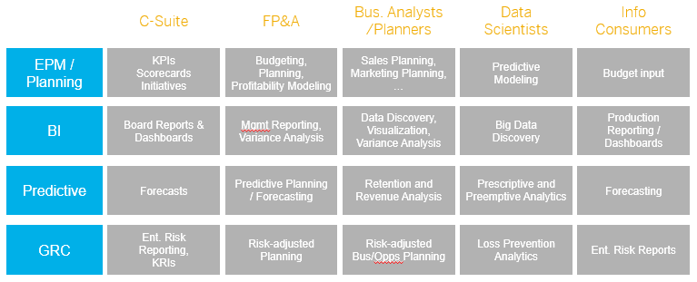
Apart from imagining the possibilities per market segment, we can also change perspectives and look at the possibilities per role within companies applying the closed loop platform. Below picture provides capabilities the closed loop components could offer to various user communities. The potential is huge and extremely powerful when used in an integrated platform. This is also the weaker point of the closed loop platform: the components must be integrated not to miss their leveraging effect on each other.

A solution is available today

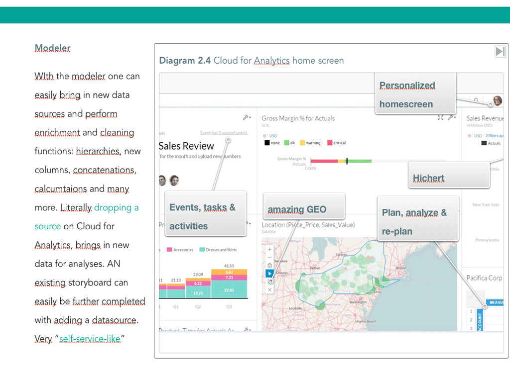
With its Cloud for Analytics offering, SAP is today the only provider with an integrated offering for the closed loop platform. Even more: SAP Cloud for Analytics is integrated in one tool offering analytics, planning, GRC and predictive capabilities. One tool?? …. Yes, one tool completely Cloud driven and utilizing the in-memory HANA Cloud Platform it is running on. One tool that seamlessly lets analytics and planning interact with each other. A tool where you can run your predictive models and analyses and visualize the outcome with the analytics section. A tool that allows access to both your on premise data, your Cloud data and/or Hadoop stored data. And lastly a tool with fully embedded collaboration techniques to share your insights with colleagues but also involve them with planning or others.  Our dream becomes reality.