Tag Archives: lumira

4 Best Practices to make your Storyboards more Dynamic and Appealing

By Iver van de Zand  – Business Intelligence & Analytics – SAP – Visualization – DataViz – Evangelist – Author of “Passionate On Analytics”

Your end users will love it when you’d deliver your story- and dashboards in a more appealing and dynamic way. In these Let Me Guide series I discuss 4 easy to use best practices that will help you doing so:

  1. Using backgrounds

  2. Using Navigation

  3. dynamic Vector Diagram pictures: SVG

  4. Dynamic Text

Using Background

Backgrounds can better the looks and experience of story- and dashboards. Use the opacity to ensure the attention is not too much distracted from the actuals graphs and charts. I tends to create my backgrounds myself using PowerPoint: create a slide with a layout you like allocating space for KPI metrics and visualizations. Save the slide as JPG which you can import as background into SAP Lumira.

Using Navigation 

If you have story- or dashboards with multiple pages, my experience is that custom navigation buttons help you users finding what they should read. I use custom navigation all the time on my storyboard’s landing pages for example. Here is how you do it:

  •  Find a shape or picture that you want to use as clickable button and save it as xx.jpg

  • Import xx.jpg as picture in Lumira and drop it on your storyboard where you want it

  • Drag and drop a rectangle shape exactly over you newly created button and set its lines and fill-color both to “none”

  • Click you “invisible” shape and add the URL or page number to it

  • Save and preview

Example landing page B

example of navigation buttons

Example landing page A

Example landing page A

Example of a core layout of a landing page for your storyboard. The color-coded tiles can be used as navigation buttons. The generic tiles act to show key metrics info. Save the core lay-out as JPG and use this JPG as core background in your storyboard. Now add an object over the color coded sections, make it invisible and add a page-link to the appropriate page in your story.

SVG files

Especially infographics gain on weight and meaningfulness if you use dynamic pictures as part of your charts and graphs. Bar- and line charts in SAP Lumira have the possibility to change its regular column and markers into a dynamic pictogram. You can use the embedded pictograms but also add your own. The pictograms need to be in the SVG dynamic vector format. Search for pictures on Google with the “ filetype:SVG” string to find SVG’s. Save and import them to Lumira and change the graphs properties. The results are impressive. It is easy to create your own SVG files: I use PowerPoint to create my own pictures and save them to JPG. Using conversion tools easily creates an SVG that you can use as dynamic chart/graph picture in your storyboards.

Dynamic Text

Dynamic Text is a powerful way to improve context sensitive messaging in your story- and dashboards. The dynamic text is based on a dataset attributes and thus changes when data is refreshed are filtered. Since SAP Lumira handles the dynamic text as any other attribute, you can also apply formulas against the text.

Brainteaser: Storyboard or Dashboard…Self-Service or Managed…you choose

By Iver Van de Zand, SAP

If there is one term that always is food for discussion when I talk to customers, it is definitely “dashboard”. What exactly is a dashboard, how close is it to a storyboard, are dashboard only on summarized data and when to use a dashboard versus a storyboard. Tons of questions that already start in a bad shape because people have other perceptions of what a dashboard really is. And let’s be honest; take a canvas, put a few pies on it and a bar-chart, and people will already mention it as a dashboard. Let’s see whether we can fine-tune this discussion a bit.

A Dashboard

A business intelligence dashboard is a data visualization technique that displays the current status and/or historical trends of metrics and key performance indicators (KPIs) for an enterprise. Dashboards consolidate and arrange numbers, metrics and sometimes performance scorecards on a single screen. They may be tailored for a specific role and display metrics targeted for a single point of view or department. The essential features of a BI dashboard product include a customizable interface and the ability to pull real-time data from multiple sources. The latter is important since lots of people think dashboards are only on summarized data which is absolutely not the case; dashboards consolidate data which may be of the lowest grain available! Key properties of a dashboard are:

  1. Simple and communicates easily and straight

  2. Minimum distractions, since these could cause confusion

  3. Supports organized business with meaning, insights and useful data or information

  4. Applies human visual perception to visual presentation of information: colors play a significant role here

  5. Limited interactivity: filtering, sorting, what-if scenarios, drill down capabilities and sometimes some self-service features

  6. They are often “managed” in a sense that the dashboards are centrally developed by ICT, key users or a competence center, and they are consumed by the end-users

  7. Offer connectivity capabilities to other BI components for providing more detail. Often these are reports with are connected via query-parsing to the dashboards

A Storyboard

Is there a big difference between a storyboard and a dashboard? Mwah, not too much: they both focus on communicating key – consolidated – information in a highly visualized and way which ultimately leaves little room for misinterpretation. For both the same key words apply: simple, visual, minimum distraction.

The main difference between a dashboard and a storyboard is that the latter is fully interactive for the end user. The interactivity of the storyboard is reflected through capabilities for the end user to:

  • Sort

  • Filter data: include and exclude data

  • Change chart or graph types on the fly

  • Add new visualizations on the fly; store and share them

  • Drill down

  • Add or adjust calculated measures and dimensions

  • Add new data via wrangling, blending or joining

  • Adjust the full layout of the board

  • Create custom hierarchies or custom groupings

  • Allow for basic data quality improvements (rename, concatenate, upper and lower case etc)

Another big difference between dashboards and storyboards is that storyboards are self-service enabled boards meaning the end user creates them him/herself. Opposite to dashboards that are typically “managed” and as such are created centrally by ICT, key users or a BICC, and are consumed by the end user.

A Dashboard versus a Storyboard

So your question, dear reader, is “what is the day-to-day difference and what to you use when”? Well the answer is in the naming of both boards:

The purpose of a storyboard is to TELL A STORY: the user selects a certain scope of data (which might be blended upon various sources) and builds up a story around that data that provides insights in it from various perspectives. All in a governed way of course. The story is built upon various visualizations that are grouped together on the canvas of the storyboard. These visualizations can be interdependent – filtering on one affects the others – or not. The canvas is further enriched with comments, text, links or dynamic pictures … all with the purpose to complete the story.

Storyboarding has dramatically changed day-to-day business: the statement “your meeting will never be the same” applies definitely. Your meetings are now being prepared by creating a storyboard; meetings are held using storyboards to discuss on topics and make funded decisions, simulations on alternative decisions are done during the meetings using the storyboards and final conclusions can be shared via the storyboards. Governed, funded, based on real-insights!

A dashboard has a pattern of analyzing that is defined upfront. It is about KPI’s or trends of a certain domain, and you as a user consume that information. You can filter, sort or even drill down in the data, but you cannot change the core topic of data. If the KPI’s are on purchasing information, it is on purchasing information and stays like it. You neither can add data to compare it.

In a number of situations one does not want the end user to “interact” with the information since it is corporate fixed data that is shared on a frequent and consistent time. Enterprises want that information to be shared for insights in a consistent, regular and recognizable way. Users will recognize the dashboard, consume the information and – hopefully – act upon it. Think for example about weekly or monthly performance dashboards, or HR dashboards that provide insights in attrition on recurring moments in time.

Dashboards and Storyboards: the “SAP way”

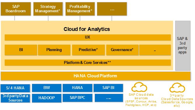
The nuances made above on dashboards and storyboards are being reflected in SAP’s Business Intelligence Suite. Its component Design Studio is a definite managed dashboarding tool. Extremely capable of visualizing insights in a simple and highly attractive way while in the meantime able to have online connections to in-memory data sources, SAP BW or semantic layers. Storyboarding is offered via the on-premise SAP Lumira or via Cloud through the Cloud for Analyticscomponent.

If you have difficulties deciding what to offer to your end users, the BI Componentselection tool I made easily helps you understanding whether your users require dashboards or/and storyboards. You might want to try it.

Financial storyboard

Financial storyboard

Self-service storyboard created in around 45 minutes using SAP Lumira. On this page the heat-map section that allows for white spot analyses. Data can be exported at any time. User has numerous capabilities to add data, visualizations and additional pages

Retailing Dashboard

Financial storyboard

Financial storyboard

Self-service storyboard created in around 45 minutes using SAP Lumira. User has numerous capabilities to add data, visualizations and additional pages

The Closed Loop portfolio in Analytics

The Closed Loop portfolio in Analytics

Authored by Iver van de Zand, SAP

We talked about the overwhelming power of analytics in Retail and B2C market-segments earlier and one of the topics discussed there, was the integration of operational business activities with operational analytics. In the example we saw the stock manager using analytics to change his stock-buying-behavior. He adjusted his order system by choosing another vendor and placing the order. Immediately his analytics are updated and he now requires to adjust his rolling planning or run a predictive simulation how the price-adjustment of his new stock might affect buying behavior of his customers. He might even want to adjust the governance rules with his new supplier or run a risk-assessment.


Below pictures visualizes the continuous integration of core business activities with business analytics, indicating examples of core processes with their accompanying analytical perspectives. These are just examples and not exhaustive at all.


Performance Management closed loop

Basically what the stock manager in our example needs, is a full – real-time – integration of business analytics with his core business activities over all aspects of his performance management domain. A predictive simulation of changing buying behavior lead to new analytical insights on product mix which might influence the companies’ budget and causes a risk analysis for new vendors.

To do so, a closed loop is required of following core components driven by the continuous flow of Discover – Plan – Inform – Anticipate:

  • online Analytics on big data with interactive user involvement
  • ability to adjust and monitor a rolling Planning for budgets, forecasts. A planning that that allows for delegation and distribution from corporate level into lower levels
  • GRC software to perform risk analyses on for example vendors or suppliers
  • online Predictive analyses components to apply predictive models like decision trees, forecasting models or other R algorithms. Predictive analyses allow to look for patterns in the data that “regular” analytics is not able to discover. The scope of predictive analytics is gigantic: think not only sentiment analyses for social media, but also basket analyses in retail markets, attrition rates in HR and many, many more.


This so-called closed loop of predictive analytics, planning and performance management, business analytics and GRC is NOT a sequential process at all. They interact randomly towards each other in real-time and at any moment needed. They are also dependent towards each other, since Digital Transformation requires us to be so agile, we have to constantly execute and collaborate on the interoperability of the components and monitor the outcome. Lastly, the closed loop platform interacts on core operational activities (real-time insights in operational data) and as such the analytics are defined as Operational Analytics.

Closed loop platforms more than anything else require business users to drive its content and purpose. They drive the agility to the platform that is so heavily needed in the Digital Transformation era. On the other hand the technical driven architects do make a difference too, since closed loop platforms are very sensitive to respect governance principles. A special role is allocated to the CFO or Office of Finance here; they will drive the bigger part of the Planning and Budgeting cycle.

One can imagine the calculation processes behind the closed loop platform are huge and therefor a business case for an in-memory system is a sine qua non.

Imagine the possibilities

Needless to say that the closed loop model applies to all industries and not only in the retail example that I used here. I can list plenty of examples here but just to name a few:


  • HR: attrition rates of employees
  • Banking & Insurance: customer segmentation, product basket analyses
  • Telco & Communications: churn and market segmentation nut also network utilization
  • Public Government: Fraud detection and  Risk-Mitigation
  • Hospital: personalized healthcare

Apart from imagining the possibilities per market segment, we can also change perspectives and look at the possibilities per role within companies applying the closed loop platform. Below picture provides capabilities the closed loop components could offer to various user communities. The potential is huge and extremely powerful when used in an integrated platform. This is also the weaker point of the closed loop platform: the components must be integrated not to miss their leveraging effect on each other.

A solution is available today

With its Cloud for Analytics offering, SAP is today the only provider with an integrated offering for the closed loop platform. Even more: SAP Cloud for Analytics is integrated in one tool offering analytics, planning, GRC and predictive capabilities. One tool?? …. Yes, one tool completely Cloud driven and utilizing the in-memory HANA Cloud Platform it is running on. One tool that seamlessly lets analytics and planning interact with each other. A tool where you can run your predictive models and analyses and visualize the outcome with the analytics section. A tool that allows access to both your on premise data, your Cloud data and/or Hadoop stored data. And lastly a tool with fully embedded collaboration techniques to share your insights with colleagues but also involve them with planning or others.  Our dream becomes reality.